
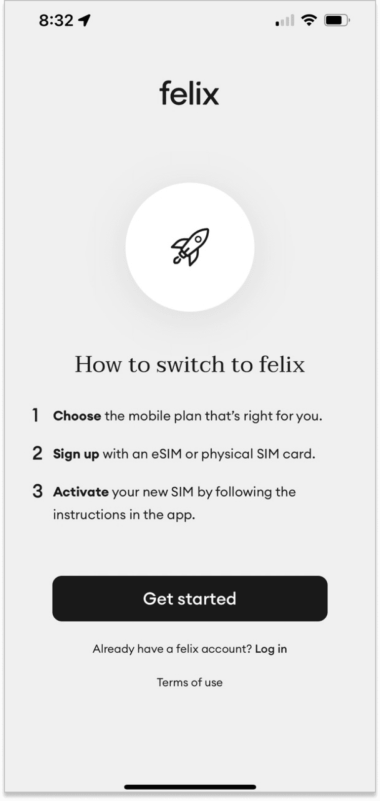
felix mobile
Creating simplicity, clarity and brand experience for mobile SIM plans
Role
UX lead
year
2022-2023
project length
4 months
deliverables
Research, Wireframes,
Prototypes, User testing
Research, Wireframes, Prototypes,
User testing
final productS
Website & App

Project Summary
I've designed the end-to-end digital experience for this Digital First mobile SIM brand - including this project which successfully introduced their great plans and service to new customers.
opportunities
for growth
Two new SIM plans launched, growing the lineup from one to three
Two new SIM plans launched, growing the lineup from one to three
Two new SIM plans launched, growing the lineup from one to three
New sales channel: felix SIM launched in retails tores
New sales channel: felix SIM launched in retails tores
New sales channel: felix SIM launched in retails tores
Design
deliverables
Web design: New product pages
Web design: New product pages
Web design: New product pages
Conversion funnel for online purchase and SIM activation
Conversion funnel for online purchase and SIM activation
Conversion funnel for online purchase and SIM activation
App design: New account management screens and brand experience
App design: New account management screens and brand experience
App design: New account management screens and brand experience
project
Outcomes
New products launched in market: Smaller data-limited plans attracted new customer segment
New products launched in market: Smaller data-limited plans attracted new customer segment
New products launched in market: Smaller data-limited plans attracted new customer segment
Felix mobile plans launched in supermarkets and convenience stores Australia wide
Felix mobile plans launched in supermarkets and convenience stores Australia wide
Felix mobile plans launched in supermarkets and convenience stores Australia wide
100% growth YOY driven by these new products and sales channels
100% growth YOY driven by these new products and sales channels
100% growth YOY driven by these new products and sales channels

Put down your smartphone!
This case-study needs a bigger screen to be seen properly.
Want design shots, interactive prototypes and project details?
Please come back when you have a laptop or tablet.
Challenge
Felix is a mobile phone plan brand owned by TPG/Vodafone. It's core values are Simple, digital, and sustainable. It launched in 2020 with a single low cost unlimited data plan that was unique in the market. It’s brand values include strong green values (100% green power and tree planting programs) and user-friendly simplicity.
In 2023 felix wanted to grow its customer base by expanding both its suite of SIM plans, and its sales channels.
A significant redesign of the website’s plan page and sales funnels was required. At the same time the app needed a redesigned sales funnel, a new SIM activation funnel for retail customers, and a plan management experience for the data limited plans.
Retaining simplicity was paramount. Felix’s team were adamant that the simplicity of their user experiences must be preserved. Like any small start-up they also needed these significant product changes to be designed and implemented quickly, and on a limited budget. As a result my design work needed to be completed in 4-5 months and also be practically achievable.
Team
Product: I had been working as felix’s lead UX designer since 2021, working closely with the felix product team of Noorjan Abboud and James Watts. In previous projects I had already designed the sales funnels and improved online help resources.
UX: In this project I received invaluable UX support from Caroline D’Souza as I carried out UX research, UX design and wireframing, UX copy writing, prototyping and user testing activities to meet felix’s design requirements.
UI: Nicholas Bozich was the very talented UI designer who refined my wireframes and completed the interface designs.
research
Customer interviews
We interviewed both existing and prospective felix customers to capture insights about felix’s perceived brand values and their customers’ purchase behaviour. The collected insights included:
Data allowance and price were the critical plan details. Other plan features and details were merely hygiene, requiring consideration to validate value driven purchase choice
Customers focused on either price or data allowance when considering potential plans. This depended largely on the tightness of their budget constraints.
Purchasing excess data was a common strategy for data-focused customers. Excess data ensured that customers never had to suffer data shaping or excess billing.
Existing customers praised the value of the felix unlimited data plan, but also reported strong support for felix’s soft values of green power and tree. These soft values may be more important for retention than conversion.
Data-banking was increasingly seen as a standard and mandatory feature for data limited plans.
Total available data was the most important plan metric for users on data limited plans. Avoiding data shortfalls and excess billing events was the critical user goal.
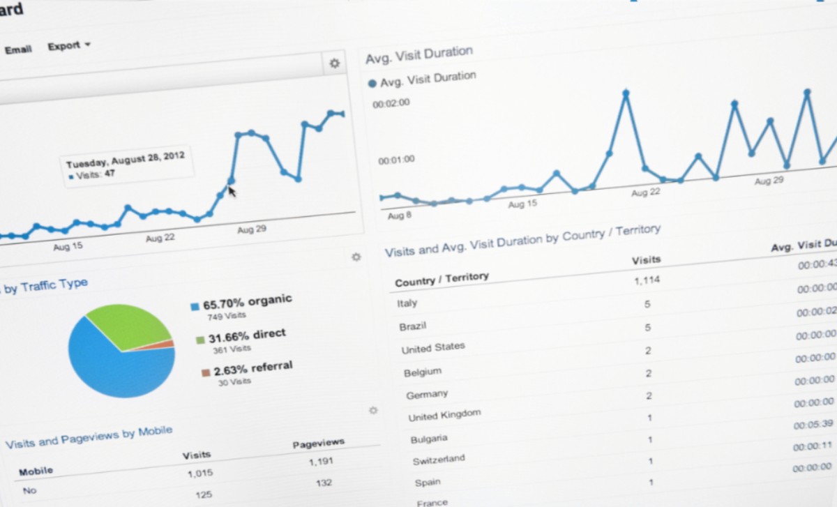
Site analysis
Website traffic data was examined and analyzed to determine traffic flows and device usage.
device breakdown was the most important plan metric for users on data limited plans. Avoiding data shortfalls and excess billing events was the critical user goal.
landing pages was the most important plan metric for users on data limited plans. Avoiding data shortfalls and excess billing events was the critical user goal.
Funnel performance was the most important plan metric for users on data limited plans. Avoiding data shortfalls and excess billing events was the critical user goal.
Other insights
My past experience in the mobile plan industry made me aware of several critical issues that needed to be addressed in the redesign.
Funnel confusion: Most SIM retailers have at least two online conversion funnel (typically one for online purchases and another for activating physical SIM cards). Session recordings show that a surprising percentage of funnel dropouts are caused by users entering the wrong funnel by mistake. A sizable minority of users struggle to distinguish between “buy” and “activate”, and another cohort tend to enter the first funnel that they discover without reading instructions. Both user groups show significant signs of confusion and frustration, and struggle to self-rectify when they make this mistake.
The impact of plan complexity: While purchase decisions were driven by price vs data allowance, plan complexity had an impact on both conversion and customer support costs. Cynicism and distrust about utility companies meant that reviewing fine print was an important hygiene step that slowed purchase decisions. For customer support, unexpected billing supports
Competitor research
Low industry standards
We conducted extensive competitor research to consider and compare the existing purchase and activation experiences of felix’s market competitors, as well as some international peers.
Disappointing results: While we initially expected competitor research to deliver a list of patterns and cues that we could emulate, it quickly became apparent that we were instead collecting a list of examples of what not to do. The majority of felix’s competitors had plan pages and sales funnels containing obvious usability design flaws. Only a few international peers (like Mint Mobile) had high usability standards.
The user challenge of comparing mobile plans on mobile devices
The task of using a mobile device to research and compare the value and benefits of a retailer’s SIM was found to be a non-trivial challenge. Few, if any, retailers in the Australian market made it easy for their consumers.
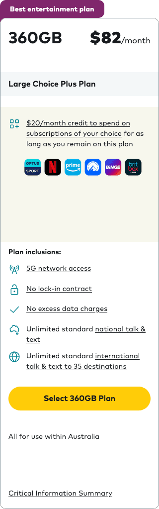
There are only two different design patterns in the domestic market
Both of these patterns make it hard to discover available plans, or to easily compare between plans.
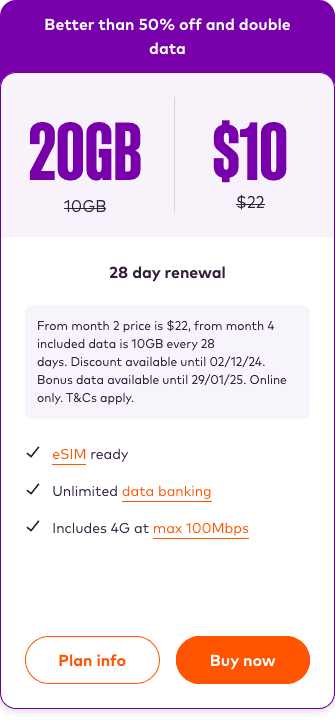
Design pattern 1: Side scrolling carousel
Discovering and comparing plans is problematic
Design pattern 2: Vertical scrolling card stack

Comparing plans is still difficult
Design
Design goals
Simple plan comparisons on mobile devices
A user should be able to easily see and compare the critical plan information of all available plans (price, data allowance) on a single screen without scrolling or tapping.
Price and data allowance to be prioritized as critical information. Other plan details are hygiene features. All details should fit on a single mobile screen.
The purchase CTA should be immediately visible and actionable on-screen without a user needing to scroll to discover them.
Foolproof purchase and activation funnels
All funnels must be simple, streamlined and meet standard affordance and design patterns.
Page copy should be short, simple and accessible. Technical language and large word counts should be avoided.
All funnels must address the issue of users entering the wrong funnel at the wrong time. Users must be able to identify their own error and self-repair, ideally without noticing the re-direction.
Memorable and user-friendly app experiences
Users should be provided with a clear summary of their account status, using accessible and on-brand language.
Users should be able to see the relationship between total data, monthly data allowance and data bank data. Total data is the priority, since it impacts on extra cost events.
Users should be able to easily purchase additional data or switch to a smaller or larger plan, but these actions should be presented contextually.
I wanted to make felix’s tree planting program a more central user experience. The impact of this program should be more emotional and experiential, rather than just reporting dry facts.

Website design
Redesigning product pages
Restructuring the website homepage
The original home page content was somewhat unstructured and repetitious. I conducted a content audit, and restructured and rewrote page copy. This strengthened the new plans proposition within the wireframes but also aided the product team’s copywriters as they set about writing final copy.
User-friendly product pages aid plan comprehension
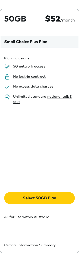
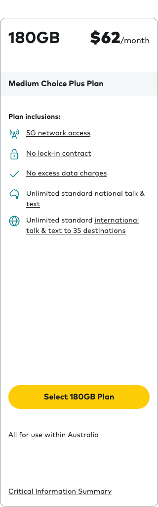
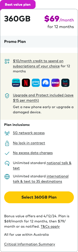
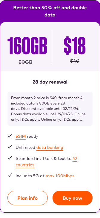
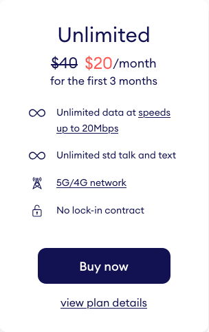
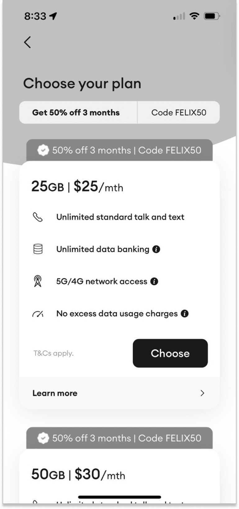
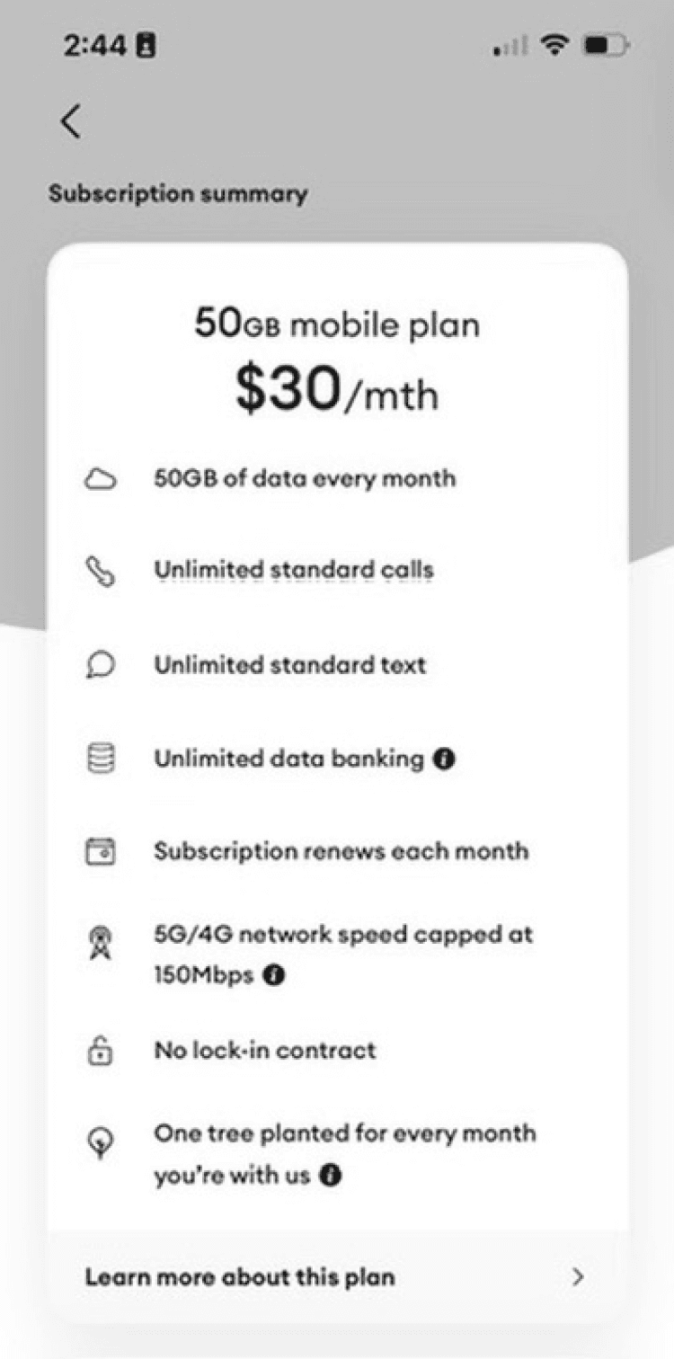
The new plan card design was intended to optimize plan comprehension and comparison for mobile devices.
The three plan price points are always visible at the top of the card, making plan comparison and plan navigation easy.
The critical plan information (price and data) are prominently displayed. Supporting plan inclusions are stacked neatly beneath.
The purchase CTA is always visible on screen and easily associated with the chosen plan.
Users can easily view alternate plans by scrolling horizontally or by tapping on the plan index at the top of the figure.
Hybrid side scrolling carousel

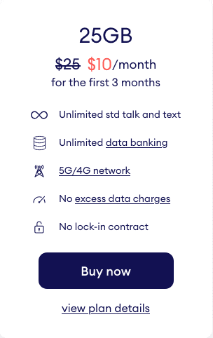

25GB
$25
50GB
$30
Unlimited
$40

Simple and transparent presentation of 3 mobile plans
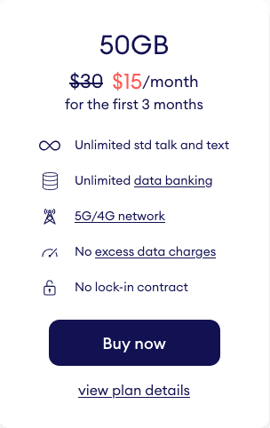
25GB
$25
50GB
$30
Unlimited
$40
Simple and transparent presentation of 3 mobile plans
Conversion funnels
Updating online sales funnels
Balancing simplicity with the business’s product goals
My initial design was for a single universal funnel that served all 3 purchase scenarios (online eSIM, online SIM card, retail SIM card). However product decisions for retail SIM card customers blocked this strategy. A minimum of 3 funnels were required to serve all customer scenarios (online purchase funnel, in-app purchase funnel, in-app SIM activation funnel)
Adding multiple plans to the existing web and app sales funnels
Minimal changes were made to these funnels, keeping development costs down. Plan details were expanded, and the ability to review and change plans within the funnel was added. Incremental usability improvements to the micro-copy were also included.
Updated web sales funnel

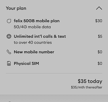

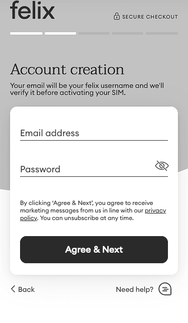
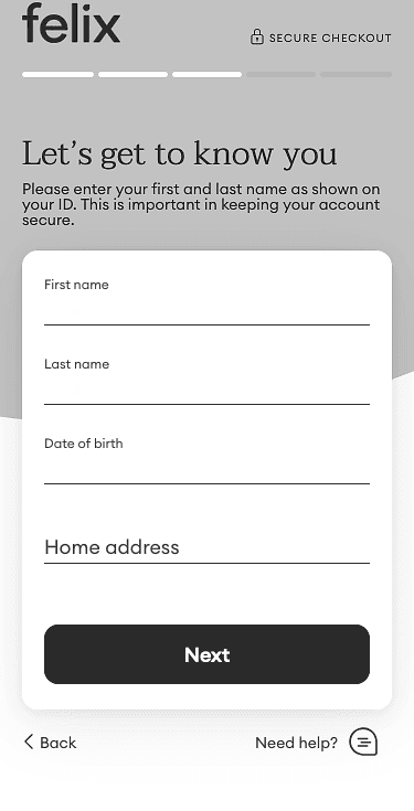
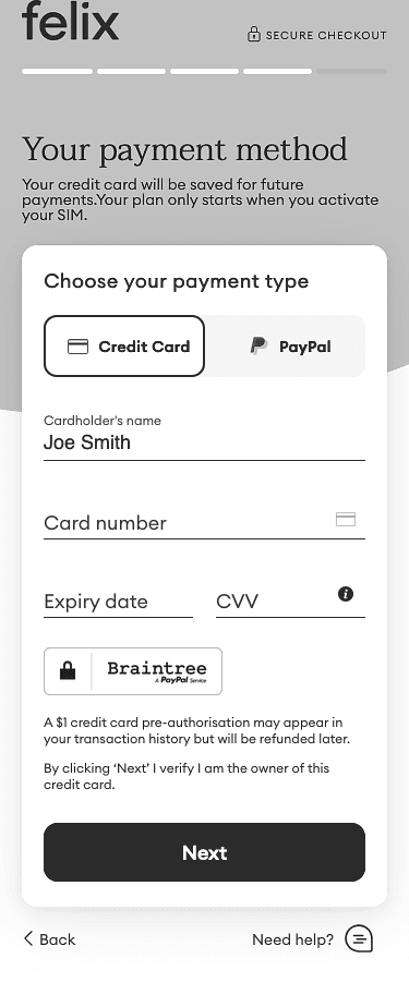
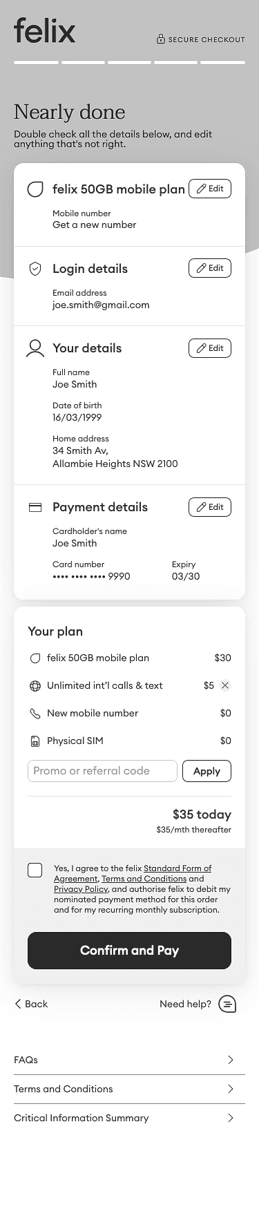
Plan choice
Account creation
Personal details
Payment method
Confirm purchase
User can now change plans in the sales funnel
Interactive prototype: Navigate by clicking on the flow diagram or the app screen
Updated web sales funnel
Plan choice
Account creation
Personal details
Payment method
Confirm purchase
User can now change plans in the sales funnel
Interactive prototype: Navigate by clicking on the flow diagram or the app screen
Conversion funnels
SIM activation for retail store customers
Retail customers needs a new SIM activation process
My initial design was for a single universal funnel that would serve all 3 purchase/activation scenarios (online eSIM, online SIM card, retail SIM card). However product decisions for retail SIM card customers blocked this strategy. A minimum of 3 funnels would be required to serve all customer scenarios:
1
Online purchase funnel
2
In-app purchase funnel
3
In-app SIM activation funnel
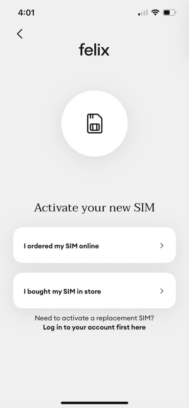
New SIM activation funnel: Re-using existing assets
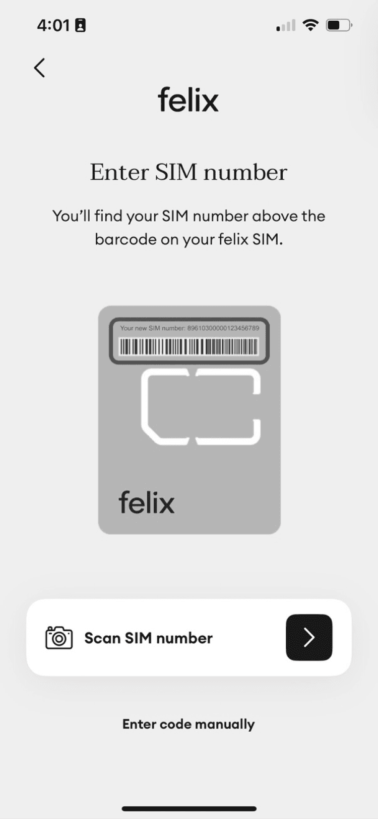
To minimize design and development costs I designed a new SIM activation funnel by re-using existing design patterns and code assets. Altering the sequence of user actions allowed retail customers to successfully create a user account and complete SIM card activation. Because these screen designs were already working successfully in market it also minimized the requirement for user acceptance testing.
The new retail SIM activation flow begins by scanning a user’s SIM number. This prevents the wrong users from proceeding further into the funnel, and determines what plans can be chosen, based on the value of the credit that came with the purchased SIM card.
Original online purchase flow for SIM cards
Install app
Choose plan
Choose SIM type
Account setup
Payment details
Postal delivery
(3-5 days)
Scan SIM number
Activate
Re-ordered user actions
New retail SIM purchase flow
Retail purchase
Install app
Scan SIM number
Choose plan
Account setup
Payment details
Activate
Conversion funnels
Preventing user confusion
Taking user confusion seriously
All of felix’s competitors host separate sales and activation funnels, relying on labelling to help users distinguish between them. As previously noted, this strategy isn’t perfect: a sizable percentage of funnel exits are due to users entering the wrong funnel. These lost users demonstrate significant confusion and distress and frequently end their session without discovering the correct funnel.
My strategy was to solve this problem by using multiple layers of disambiguation, and by getting users to identify their user journey by their SIM type rather than relying on their ability to successfully parse the difference between labels like “Buy”,”Sign up” or “Activate”.
While these changes made application flow diagrams more complicated they did not add significant dev costs, and an individual user would experience their individual journey as being simpler and more intuitive than the alternative.
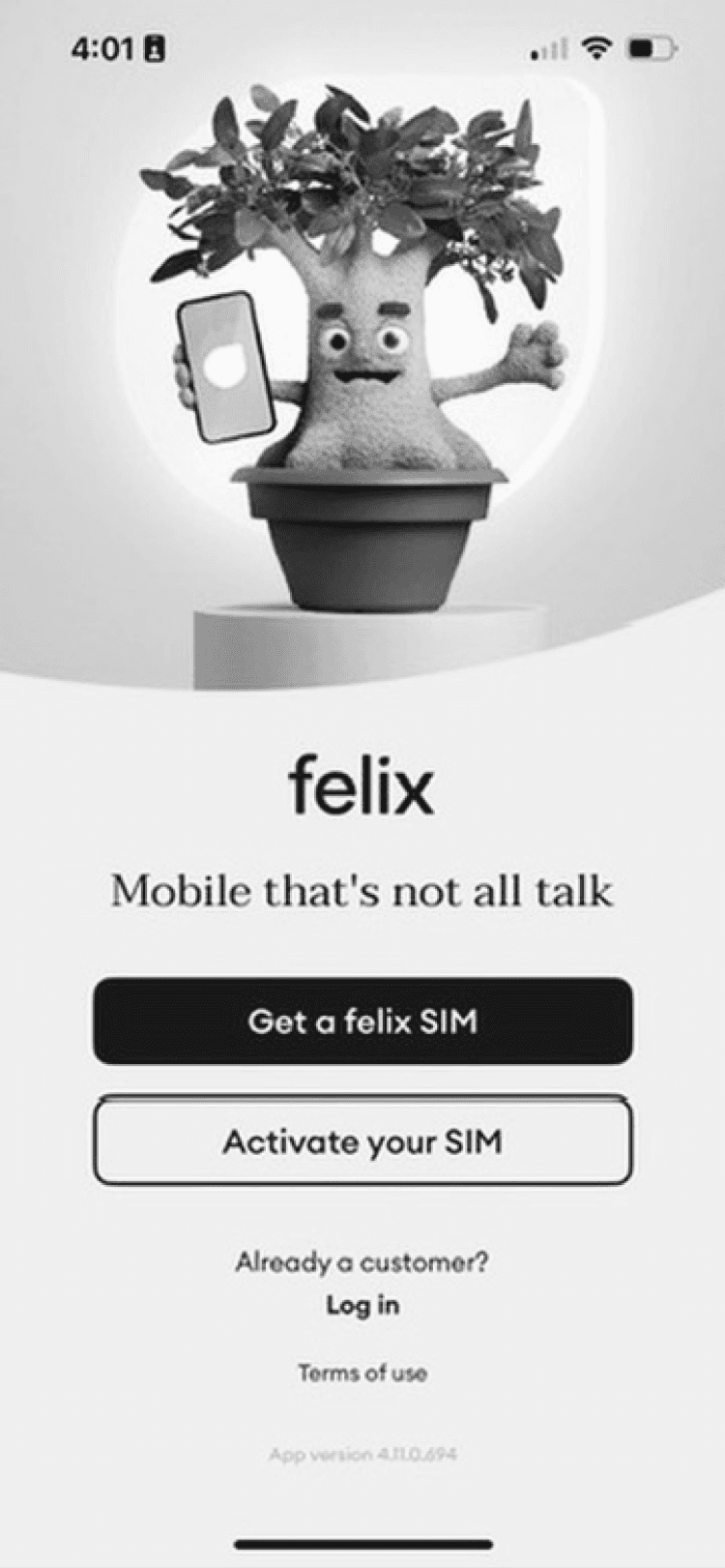
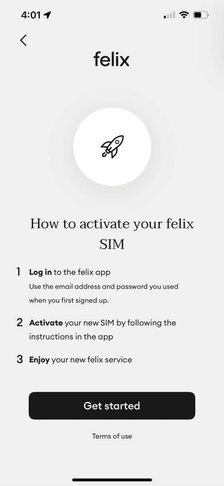
New app start screen welcomes all
The original felix app’s welcome screen needed only two CTAs, “Sign up” and “Log In”.
The updated designs added an additional CTA that supported retail SIM customers activating their store bought SIMs. The new user flow also included important disambiguation steps to protect users from entering the incorrect purchase or activation funnel.
Welcome screen
Login screen
Start purchase
Activate SIM
Retail SIM
Online SIM
Choose plan
Create account
Complete funnel
Scan SIM
Choose plan
Create account

Directing new, onboarding and existing users in the app
Two calls to action for onboarding scenarios
Welcome screen
Login screen
Start purchase
Activate SIM
Retail SIM
Online SIM
Choose plan
Create account
Complete funnel
Scan SIM
Choose plan
Create account
Directing new, onboarding and existing users in the app
Two calls to action for onboarding scenarios
Interactive prototype: Navigate by clicking on the flow diagram or the app screen
Conversion funnels
Redirecting lost users
Redirecting users who enter the wrong funnel
My strategy was to add a simple and intuitive hygiene check to all funnels that would catch and redirect lost users, ideally without them noticing the redirection.
The retail SIM activation funnel was automatically protected by its first step, which required the SIM ID of a physical SIM card purchased in a retail store.
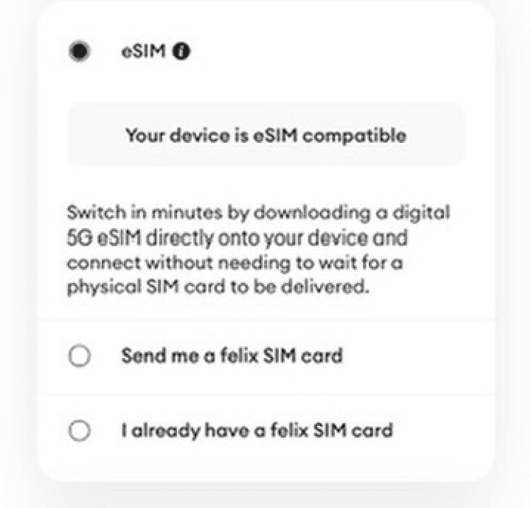
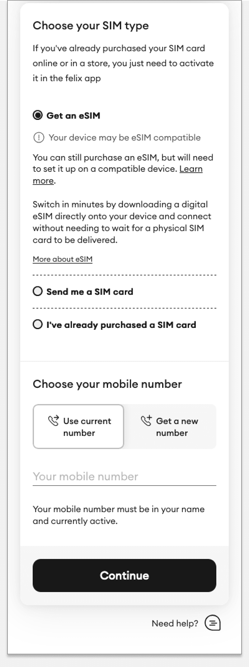
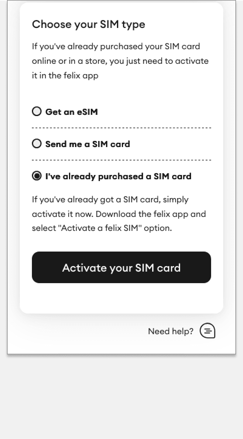
The online and in-app purchase funnels were updated to include a third choice for the Choose your SIM type question:
Get an eSIM.
Send me a SIM card.
I’ve already purchased a SIM card.
When tested users found it easier to identify their correct scenario by identifying their SIM choice rather than distinguishing between “Buy”,”Sign up” or “Activate” CTAs.
Redirecting lost users to the correct funnel
User clicks Continue to complete purchasing SIM plan
Choose a new eSIM (Note instructional text)
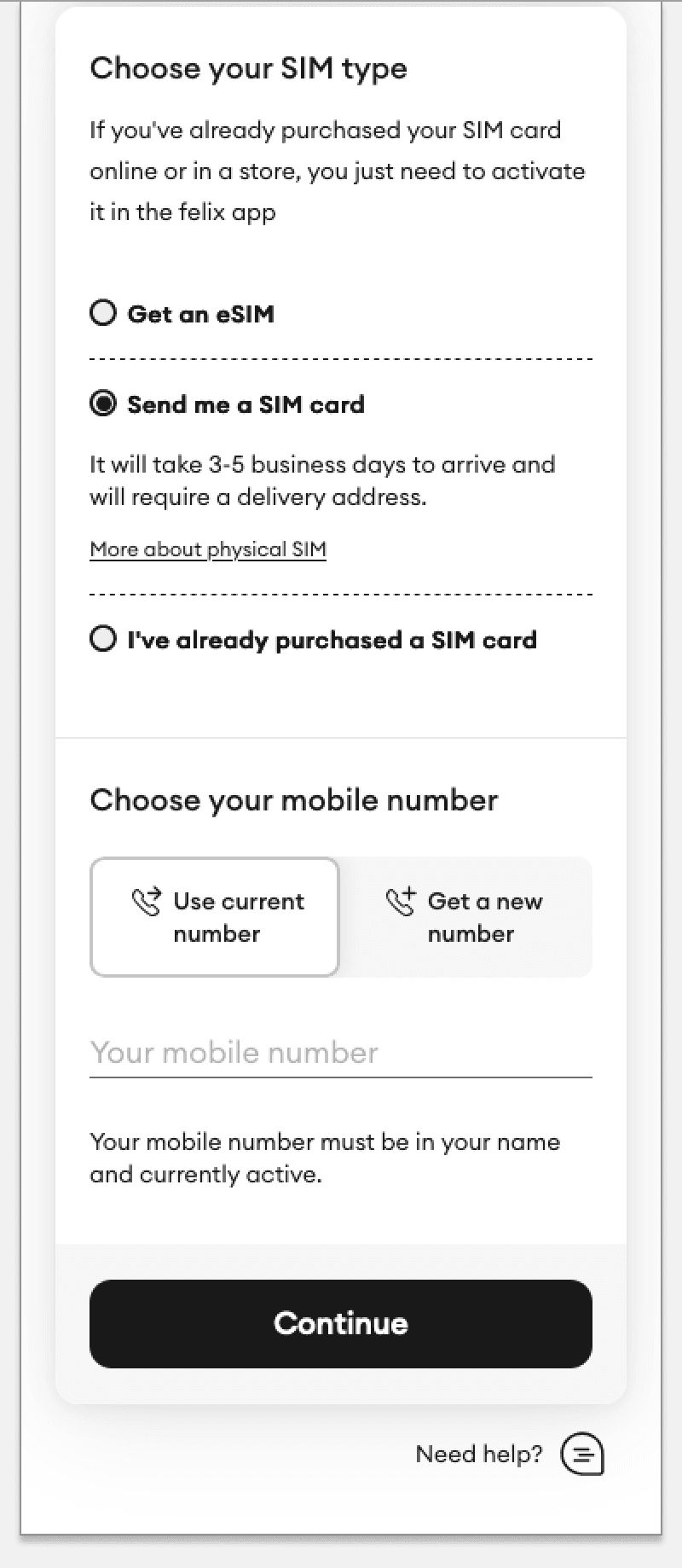
Interactive prototype
App design
Account management for new plans
Prioritizing emotions not maths
Mobile plans (much like the engineers and the designers that work on them), are very logical constructs. Yet the humans who use these plans are much more varied than this. Many users prefer to relate to things primarily through words, visuals or emotions rather than numbers.
On that basis I resolved to create a design that used visuals (animated bar graphs) as well as words and emotions (micro-copy) to convey meaning. The status of an account should be perceivable through multiple modalities, and not simply be a matter of subtraction or addition.
This strategy would allow the felix interface to stand out from most of its peers, as well as giving opportunities to play with words and colour that would work well with the playful and heartfelt felix brand experience.
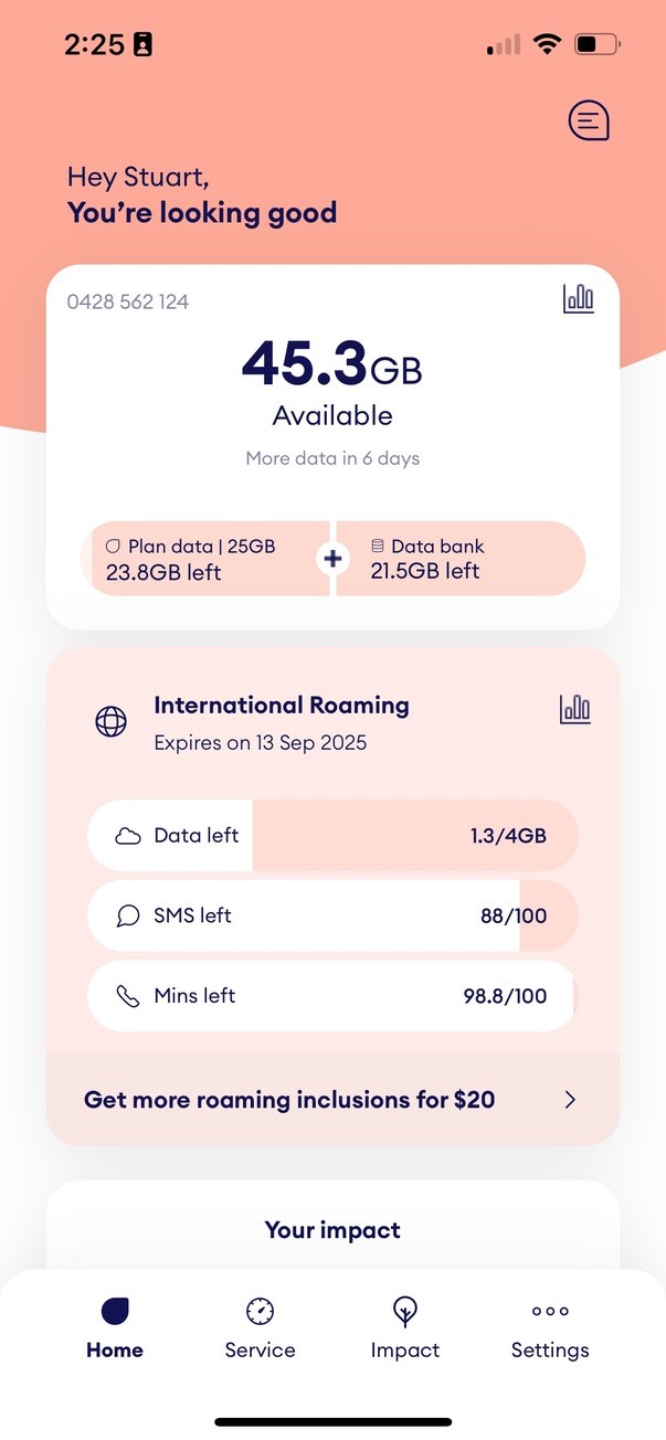
Communicating plan status
For users on a data limited plan there are 4 critical pieces of information that need to be communicated
Total available data
Time/date to next plan renewal
Monthly plan data remaining
Data bank data
User research showed that, while all of this information is of value, the total available data and time to plan renewal were the most critical. Running out of available data (and possibly having to pay for extra) was the critical experience that needed to be tracked.
The sequencing of information in my final design was based on this insight. Where graphs were used to communicate value visually, animated transitions gave intuitive cues as to the bar graph logic.
Simple and elegant account management screen
Hey John,
You’re looking good
Plan data | 50GB
26.4GB left
+
Data bank
38.8GB left
65.2
GB
Available
More data in 9 days
Usage
0411 246 579
Your impact
Trees planted on your behalf
(and counting...)
14
2.3m
donated in total
You’re helping reforest the planet. Did you
know one tree can absorb up to 21kg of CO2
a year?
Track the felix impact

Donate data and grow your forest!
We’ll plant one extra tree every time you donate 20GB from your databank
Contextual status message tells user how their account is going
Total available data and time to next renewal is most critical information
Breakdown of available data between plan data and data bank
View usage history
App design
Contextual user actions
Contextual user actions
At certain points the ability for a user to purchase additional data or upgrade to a larger plan can be critically valuable. However these use-cases are typically rare. In most mobile phone apps the strategy is thus to place these low frequency features deep in user interfaces. When users need to top-up or upgrade they need to search (sometimes fruitlessly) for this functionality.
My design places these features prominently within the main Home interface, but only displays them when the context warrants it.
The user flows are short and clear, and on completing the flow the Home interface updates immediately with both text, visuals and numbers explaining the change.
Data top-ups and plan upgrades in the app
Welcome screen
Low data
No data
Add top-up
Upgrade plan
Topup applied
View new data
New plan applied
View new plan
Hi Mark,
You're looking good
Plan data | 20GB
2.16GB left
+
Data bank
12.9GB left
15.1
GB
Available
More data in 12 days
Usage
0411 246 579
Your impact
Trees planted on your behalf
(and counting...)
14
2.3m
donated in total
You’re helping reforest the planet. Did you
know one tree can absorb up to 21kg of CO2
a year?
Track the felix impact
Interactive prototype: Navigate by clicking on the flow diagram or the app screen
App design
Brand experiences
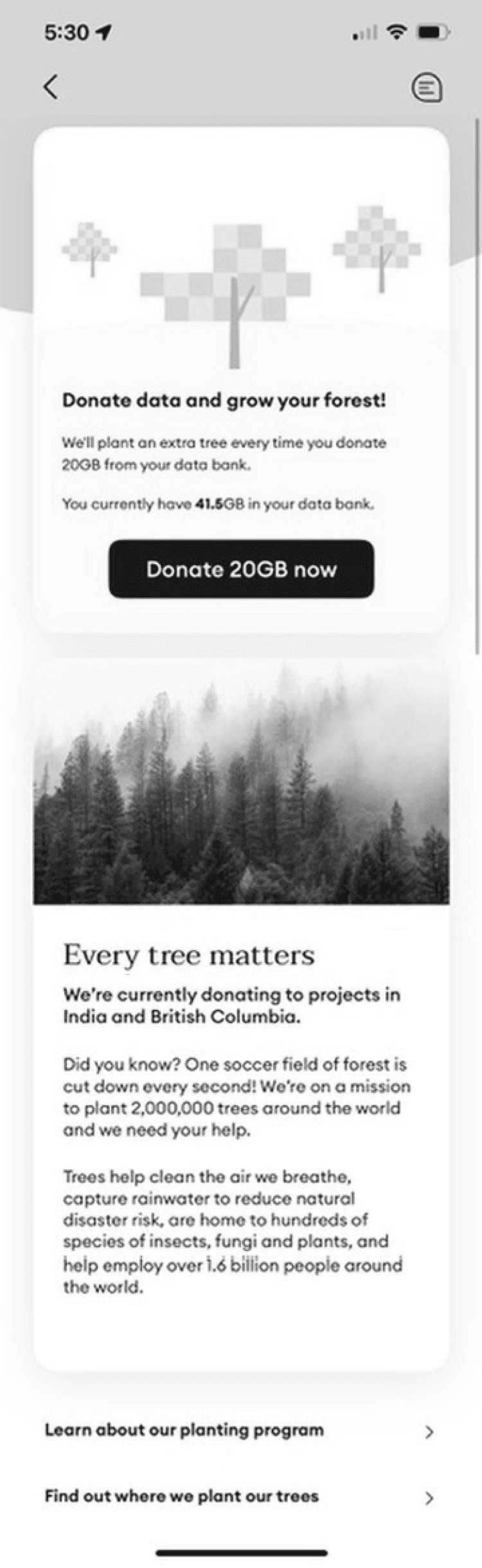
Making felix’s tree planting program a brand hero
Felix’s tree planting program promises to plant one tree per customer per month. While this environmental program is not a significant decision for prospective customers considering felix, existing customers repeatedly report how much it impacts on how they feel and relate to the brand.
The original design that reported on this program was very basic, and as previously discussed, was limited to communicating through the mathematical domain.
My design update aimed to strengthen a user’s emotional engagement with their program by visualizing and personalizing it as a small but growing forest.
I believe that this concept can be pushed further and turned into a real brand moment. The addition of animated features like butterflies or birds would add more life, an element of surprise, and thus more delight and engagement with both the app and the tree planting program.
Updated hero experience makes tree planting more memorable
Hey John,
You’re looking good
Plan data | 50GB
26.4GB left
+
Data bank
38.8GB left
65.2
GB
Available
More data in 9 days
Usage
0411 246 579
Your impact
Trees planted on your behalf
(and counting...)
14
2.3m
donated in total
You’re helping reforest the planet. Did you
know one tree can absorb up to 21kg of CO2
a year?
Track the felix impact
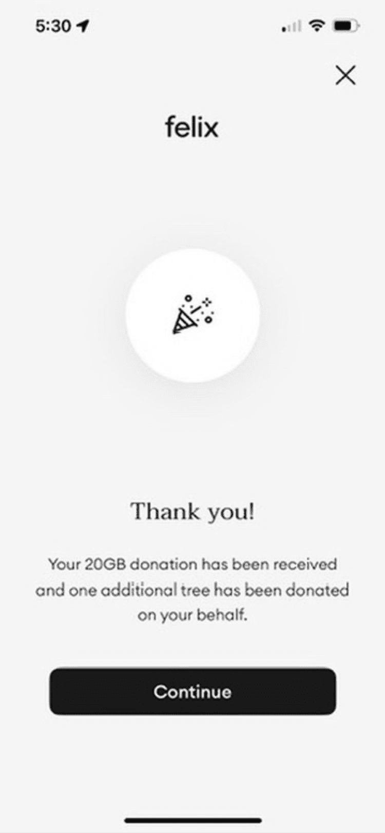
Donate data and grow your forest!
We’ll plant one extra tree every time you donate 20GB from your databank
A user can now donate unused data to plant more trees.
A user can now donate unused data to plant more trees.
What is the impact? Total trees planted, and the benefit of planting a tree.
Planted trees are represented as a forest. Users watch their forest grow over time
Planted trees are represented as a forest. Users watch their forest grow over time
Interactive prototype
User testing
User testing
Validating design decisions
Prototyping using Framer
Figma wireframes were exported to Framer and prototypes developed on that platform. Framer was chosen as the prototyping platform since it had much more sophisticated motion design controls than Figma.
Validating concepts using user testing
Several key scenarios were tested by user testing using these prototypes:
First impressions and interaction testing for new plan cards.
Activation flow for retail customers (inc. testing the funnel protections).
First impressions of the app.
Low and no data scenarios where a user could choose to upgrade their plan or buy a data pack topup.
New plan cards
Figma wireframes were exported to Framer and prototypes developed on that platform. Framer was chosen as the prototyping platform since it had much more sophisticated motion design controls than Figma.
Activation flow for retail customers
Figma wireframes were exported to Framer and prototypes developed on that platform. Framer was chosen as the prototyping platform since it had much more sophisticated motion design controls than Figma.
First impressions of the app
Figma wireframes were exported to Framer and prototypes developed on that platform. Framer was chosen as the prototyping platform since it had much more sophisticated motion design controls than Figma.
Upgrade and top-up flows
Figma wireframes were exported to Framer and prototypes developed on that platform. Framer was chosen as the prototyping platform since it had much more sophisticated motion design controls than Figma.
Project outcomes
Outcomes
New products grew felix's customer base and bottom line
The new smaller plans appealed to a different customer base. The existing customers on data unlimited plans did not churn to cheaper plans. Felix's unique offering, the data unlimited plans continued to be their best-seller - though now at a higher price-point. This has resulted in 100% growth YOY.
New sales channel became active
Felix mobile plans are now available in major national supermarkets and convenience store chains.
Strengthened brand values and brand experience
The redesigned felix app presents felix's tree planting program more effectively, and customers can now donate unused data to support the tree planting program.
Happy product owners
"This project not only delivered measurable business outcomes, (increased customer acquisition and retention) but also reinforced our focus on sustainability and customer-centric innovation. Stuart’s dedication to creating intuitive and impactful user experiences was a driving force behind this success."
Noorjan Abboud, Product Owner


WANT TO get in touch?
Let’s chat
Thanks for checking out my work.
I believe in rapid iteration, early sharing, and learning from mistakes. I believe that design is about solving problems, not creating art. Good design aims to make small, meaningful improvements to people’s daily lives.
If you want to work with me, or learn more about my design process, don’t hesitate to get in touch.
Copyright © 2024 Stuart Steel
WANT TO get in touch?
Let’s chat
Copyright © 2024 Stuart Steel