
RADICALLY SIMPLE ENERGY PLANS
Designing innovative pre-paid energy plans
Role
Senior/Lead UX
year
2018-2019
project length
18 months
deliverables
User research, product design,
wireframes, prototypes, user testing
final product
Novel retail
energy plans
Pre-paid subscription energy plans
Pre-paid subscription energy plans
No bill shock. No price rises. No worries.
No bill shock. No price rises.
No worries.
No bill shock. No price rises. No worries.
Project Summary
I was the principle UX designer on amaysim's journey to launch a new kind of subscription energy plan onto the Australian market
opportunities
for growth
Austalian consumers hate their energy plans, citing bill shock and confusion
Austalian consumers hate their energy plans, citing bill shock and confusion
amaysim had already disrupted pre-paid mobile bills: pre-paid mobile bills are now the norm
amaysim had already disrupted pre-paid mobile bills: pre-paid mobile bills are now the norm
Product design
User research: 80+ subjects interviewed through the process
User research: 80+ subjects interviewed through the process
Key user values identified: Users wanted simpler plans and predictable billing
Key user values identified: Users wanted simpler plans and predictable billing
Solution design: amaysim designed a pre-paid energy plan that worked like a pre-paid mobile plan
Solution design: amaysim designed a pre-paid energy plan that worked like a pre-paid mobile plan
project
Outcomes
Novel product launched: Test subjects responded positively to its features
Novel product launched: Test subjects responded positively to its features
Poor cut-through for early sales: Early sales performance was less than post-paid plans
Poor cut-through for early sales: Early sales performance was less than post-paid plans
amaysim sold its energy arm: amaysim's corporate priorities limited investment in marketing and product development
amaysim sold its energy arm: amaysim's corporate priorities limited investment in marketing and product development

Put down your smartphone!
This case-study needs a bigger screen to be seen properly.
Want design shots, interactive prototypes and project details?
Please come back when you have a laptop or tablet.
Challenge
In 2010 amaysim had launched in the Australian mobile plan market, introducing Australia's first fixed price pre-paid mobile plans – a now universal solution to the billing complexity and bill shock that had previously been the norm for mobile phone plans.
Recognizing that complex billing and bill shock were still the norm for electricity bills, amaysim bought Click Energy in 2017, planning a similar disruption for electricity plans.
Market context
Why Australian energy plans are terrible
Taking advantage of consumer behaviour, Australian post-paid electricity retail plans are designed to actively exploit Australian consumers. I've sat in their meetings: Sales managers and product owners in this industry actively enact product design and marketing plans that would be considered indefensible in other contexts.
Complex plans cause consumer confusion and disengagement
Every standard electricity plan is composed of a daily supply charge and a power consumption charge. Because a plan that has low usage charges inevitably has high supply charges, and vice versa, comparing competing plans is mathematically challenging for most users. Accurately comparing different plans really requires expert level skills with spreadsheet or calculator - many consumers feel like it’s an impossible task.
Retailers exploit disengaged customers
Because plan complexity makes plan choice such hard work and so confusing, most electricity consumers give up on making active consumer decisions.
Retailers take cynical advantage of this. Consumers sign up on competitively priced acquisition, not realizing that over the next one or two years the retailer will schedule in multiple rate hikes, adding 10-20% to the original plan prices. The retailer will frame this as market led price hikes, even as they launch new acquisition plans at the original price points.
Because consumption varies, and bills are hard to read and understand, most consumers fail to notice these price rises and stay on their overpriced plans. While unpredictable wholesale costs require retailers to hedge against risk, this is clearly predatory behavior - energy retailers regularly post higher profit margins than comparable utilities.
The consumer perception of value is deeply corrupted
Because of the high profit that can be extracted from long term customers, retailers heavily discount acquisition plans, even pricing them below cost at times.
Because of rising energy prices, and the public conversations about them, consumers feel like electricity is overpriced, even when comparing these “cheap” acquisition prices.
Bill shock is common and traumatic
Unpredictable electricity consumption, combined with the retailers tendency to lift rates by stealth, means that surprisingly large bills are common in the industry. This experience is referred as “bill shock” and causes real and memorable hardship to the consumers who experience it.
A prime example was interviewing a test subject with significant visual impairment. He had been unable to read intentionally obscure text notifying him of a 20% price hike. He only discovered the price hike through bill-shock and the emotional damage lasted much longer than the financial hardship.
user research
Interviewing energy customers
As amaysim’s senior energy UX designer I led 2 rounds of user interviews, interviewing Australian energy consumers in NSW and Victoria. Interviews were held at a time where high energy prices had become a public and political talking point. Subjects were interviewed about:
Their experience and history as energy consumers
Their pain points
How they chose between competing energy plans
Our high level findings confirmed:
"They're all cheats": High levels of distrust and cynicism towards retailers
"These plans are so confusing!": User frustration over complex plan structures
"I was on the phone for an hour": Frequent stories of consumer frustration and distress
"I just burst into tears": The personal cost of bill-shock
Based on these finding the product team assumed that the energy market was ripe for disruption.
User persona design
User persona design
Based on user interviews I devised 3 user personas to explain different user behaviors. These user personas were defined by user behavior and world-views rather than gender, age or other demographic differences.
Persona 1: PRYCE HUNTER
“Low trust, High market participation”
About a third of recruited test subjects interviewed were “Pryce Hunters”. These users were notable because:
They were aware of the retailers’ strategy of raising prices for long term customers.
They found it easy to understand and compare energy plans (frequently using spreadsheets)
They changed plans or retailers every 9-12 months, exploiting sign-up offers
They actively enjoyed bargain hunting
Because of the time and education requirements, Pryce Hunters tended towards being younger, single and professional.
Persona 2: BILL EASY
“High trust, Low-medium market participation”
Just over half of all test subjects were “Bill Easy” users. These users were notable because:
They had relatively low awareness that retailers raised prices for long term customers
They believed that customer loyalty should be rewarded, not exploited
Low understanding of how plans work, or how to compare competing plans
They usually changed plans or retailers every 3-4 years
They felt vaguely guilty or uneasy that they weren't shopping for a better plan
Tending towards being time poor, Bill Easy was often a busy parent
Persona 3: SUE SPICIOUS
“Low trust, Low market participation”
Sue Spicious were the least common persona. While they were seen throughout the interview process they were only clearly identified during proposition testing:
Very high levels of suspicion and cynicism towards retailers (and any other corporate entity)
Very low understanding of how plans work, or how to compare competing plans
Doesn’t believe that they are capable of finding a better plan
Ironically, Sue Spicious was typically the slowest to change plans (5+ years), and thus on the worst deal
Shopping for a new plan only seems to be initiated by moving house
Product design
Product design
Product ideation (interupted)
Product ideation (interupted)
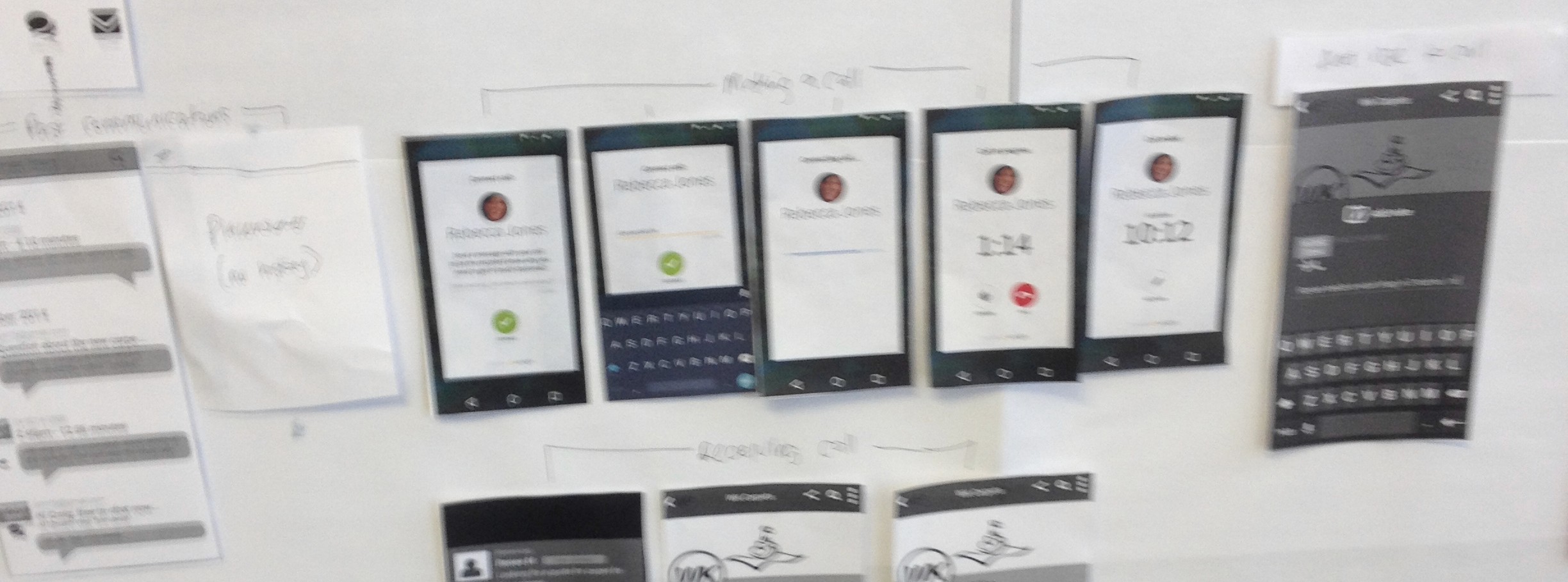
Wireframes expand on Product Team concepts
I built a number of wireframes that expanded on ideas generated by the product team. These higher fidelity models helped the product team mature and compare their propositions.
User testing with interactive prototypes
I then built 4 different interactive product prototypes which were tested with recruited energy consumers. These user tests were designed to collect qualitative feedback on product ideas and to sense-check their relative value propositions.
Users reported that they wanted wanted energy plans that included:
Pricing transparency: Bills that are easy to understand
Pricing transparency: Bills that are easy to understand
Predictable billing: No bill shock
Predictable billing: No bill shock
While user tests were generally positive, no final product model had yet been settled on. More importantly, propositions had not undergone market acceptance testing.
Product design is cut short by corporate timelines
Unfortunately (hidden) corporate timelines triggered an executive team decision to launch these new energy plans before appropriate UX work could be completed. Our team shifted to designing user flows and interfaces, while we waited for the product team to define what the final product design would be.
When a product definition was finally presented it looked good, however it had not been validated through user testing, and this would become evident later.
amaysim launches pre-paid energy plans
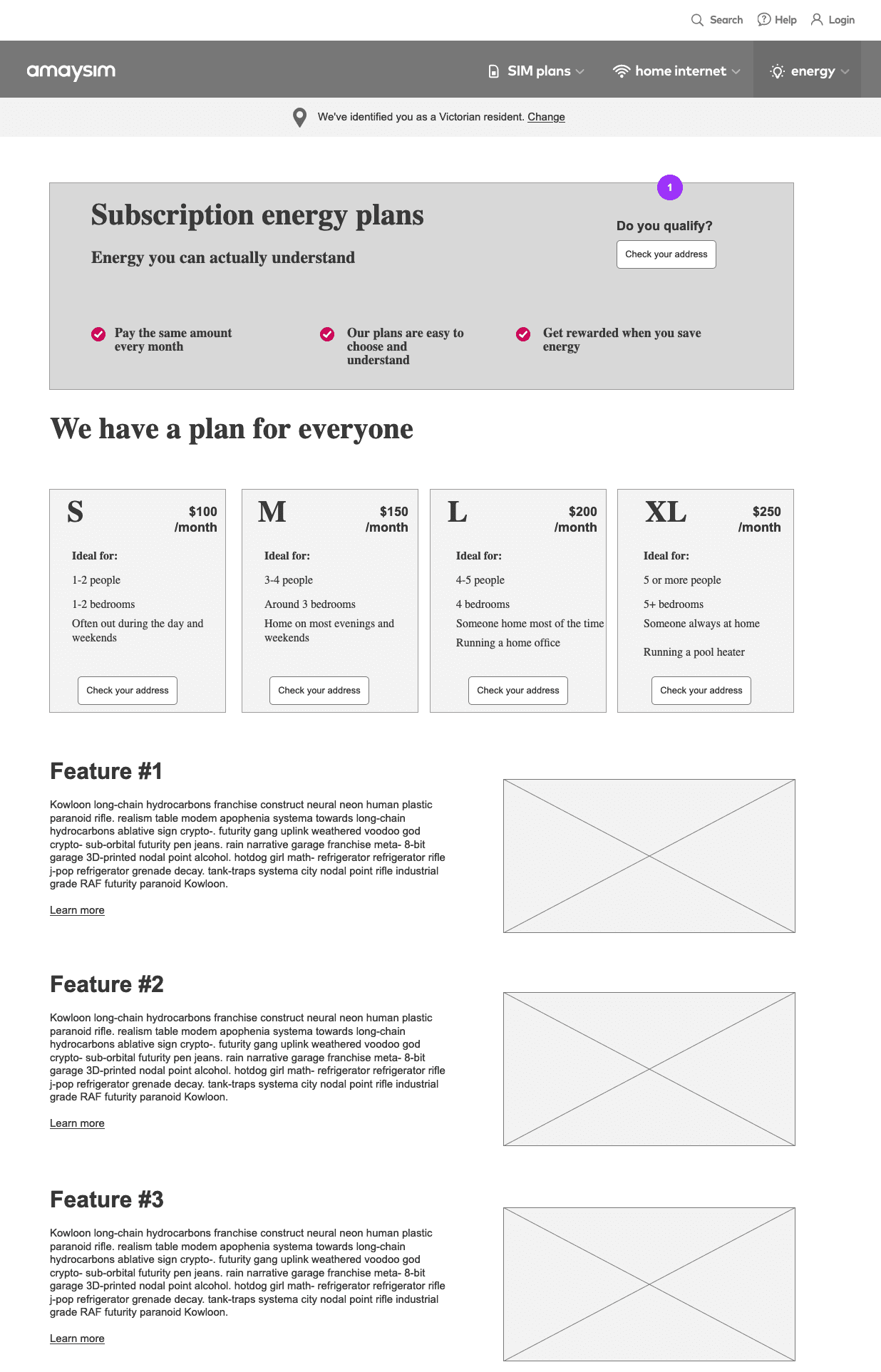
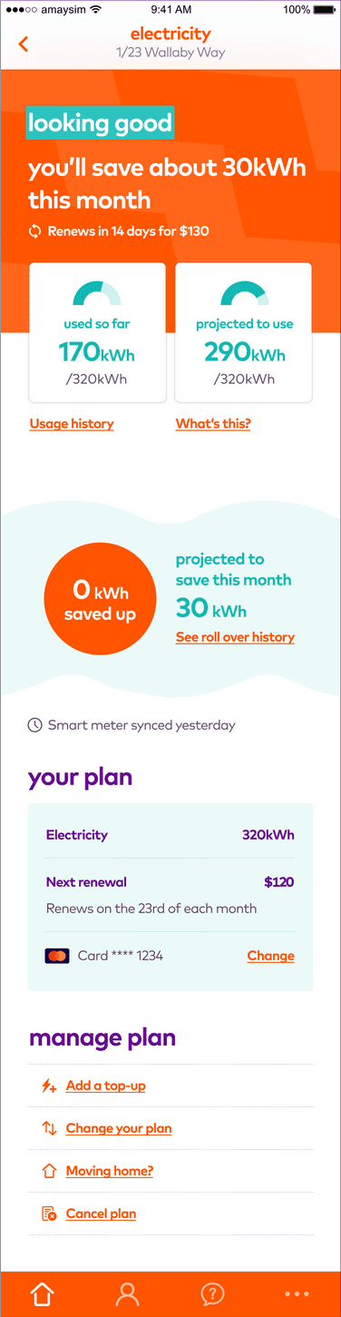
Plan features
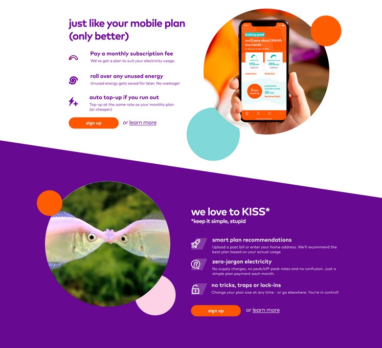
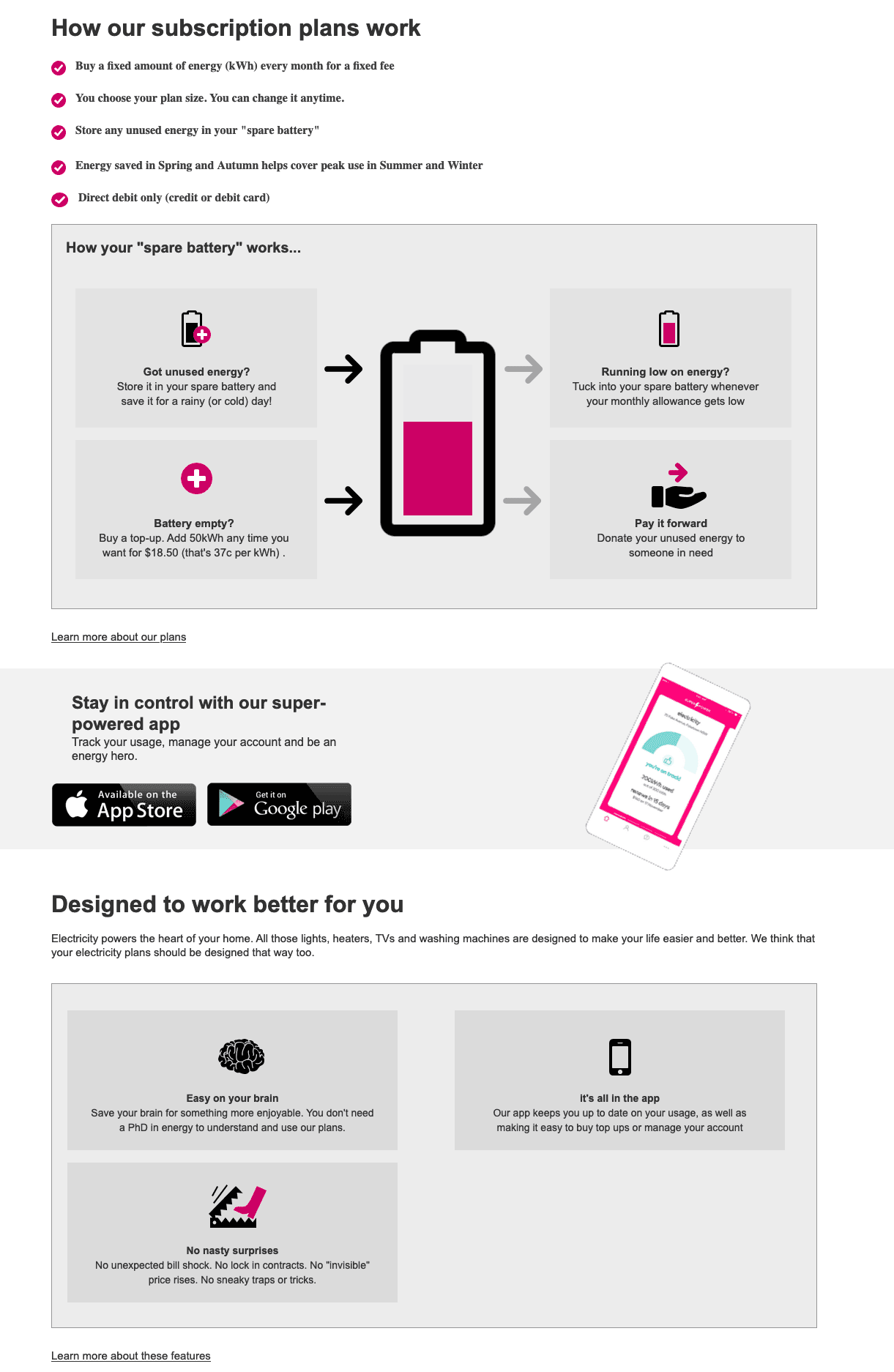
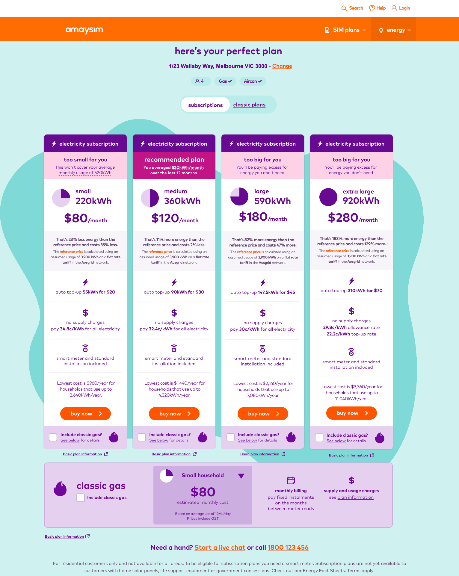
Amaysim’s pre-paid energy plans had the following features:
Fixed monthly fees: Each of the 4 plans charges a fixed monthly fee for a fixed monthly energy allowance
Fixed monthly fees: Each of the 4 plans charges a fixed monthly fee for a fixed monthly energy allowance
Roll over unused energy: Any unused energy rolls over to use later. Saved energy never expires
Roll over unused energy: Any unused energy rolls over to use later. Saved energy never expires
Never run out of power: Auto-topups when you need them
Never run out of power: Auto-topups when you need them
Upgrade or downgrade at any time: Never lose your rollover energy
Upgrade or downgrade at any time: Never lose your rollover energy
Design
Design
Leading the UX team
Leading the UX team
Designing end to end digital experiences in a short time span.
As the UX team began designing new purchase and user interfaces I was promoted to fill the lead UX role at amaysim. I led the three person team for the rest of the 6 month process.
I was personally responsible for designing the new plan comparison and purchase experience. Later on I also completed final work on the web and app-based user account management experiences as well.
Early wire frames
User flows
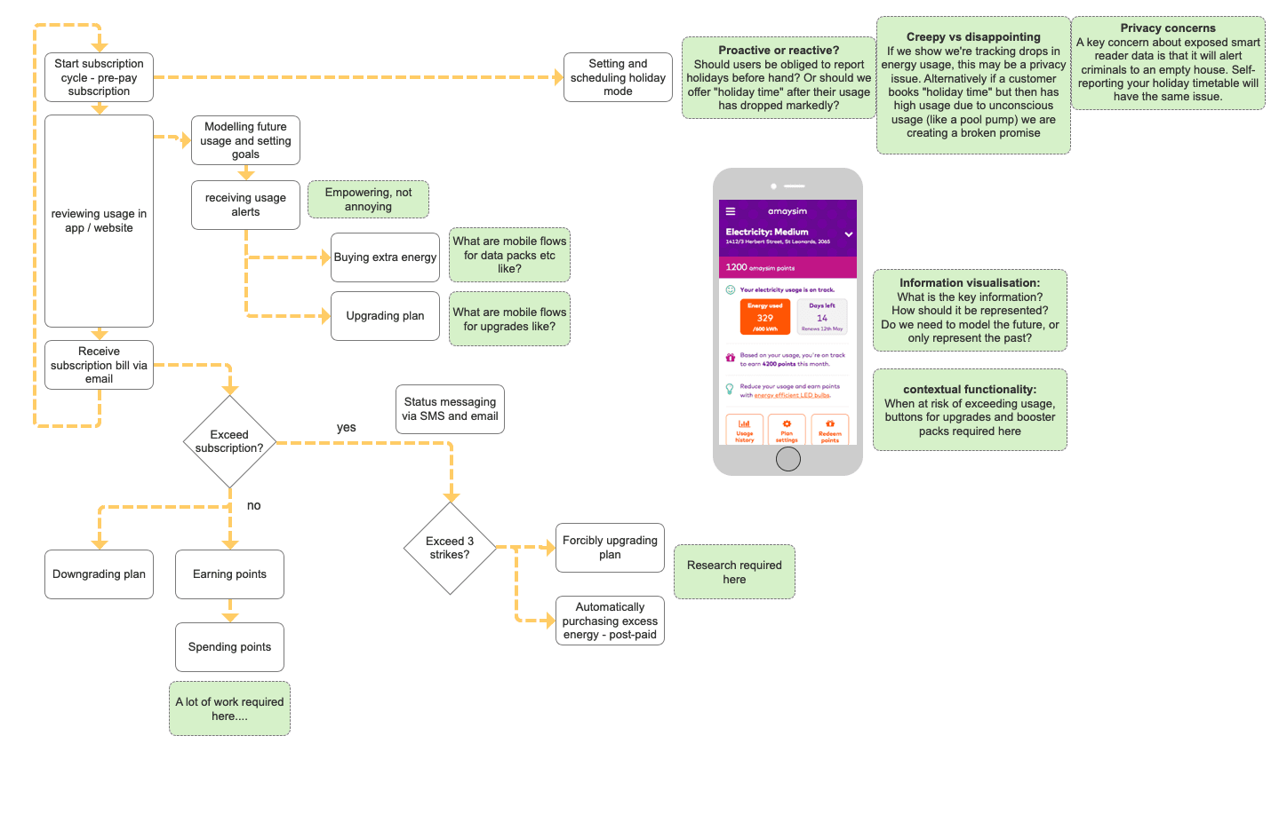
Explaining product features

Simplifying the billing experience
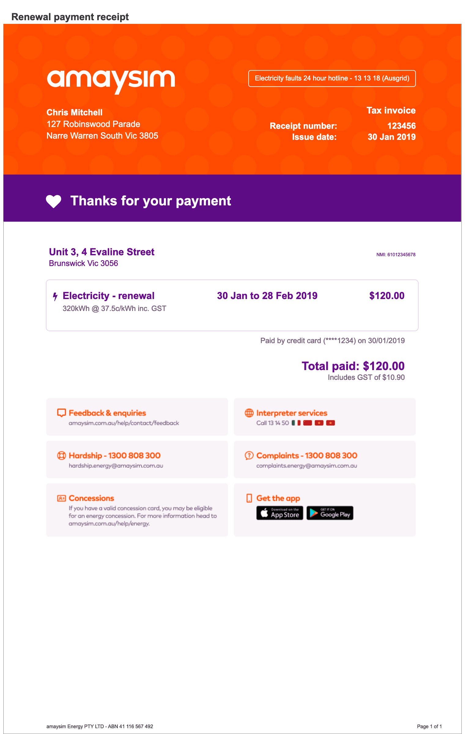
Simplifying the billing experience
Making energy bills understandable
Test subjects stated repeatedly in user testing that they were prepared to pay a small premium for simpler, safer energy plans. This extended past the purchase experience to include billing as well. Only Pryce Hunters knew how to accurately read an energy bill, most consumers found them impenetrable.
Our design team's insight was that users did not think of their retailer when they turned on a power switch, but only when they received a bill. Receiving and paying bills was the product experience for an energy retailer.
Our design team set about redesigning the billing experience by stripping out 90% of the billing complexity, and including simplified reporting, and consumption modelling in the digital app experience.
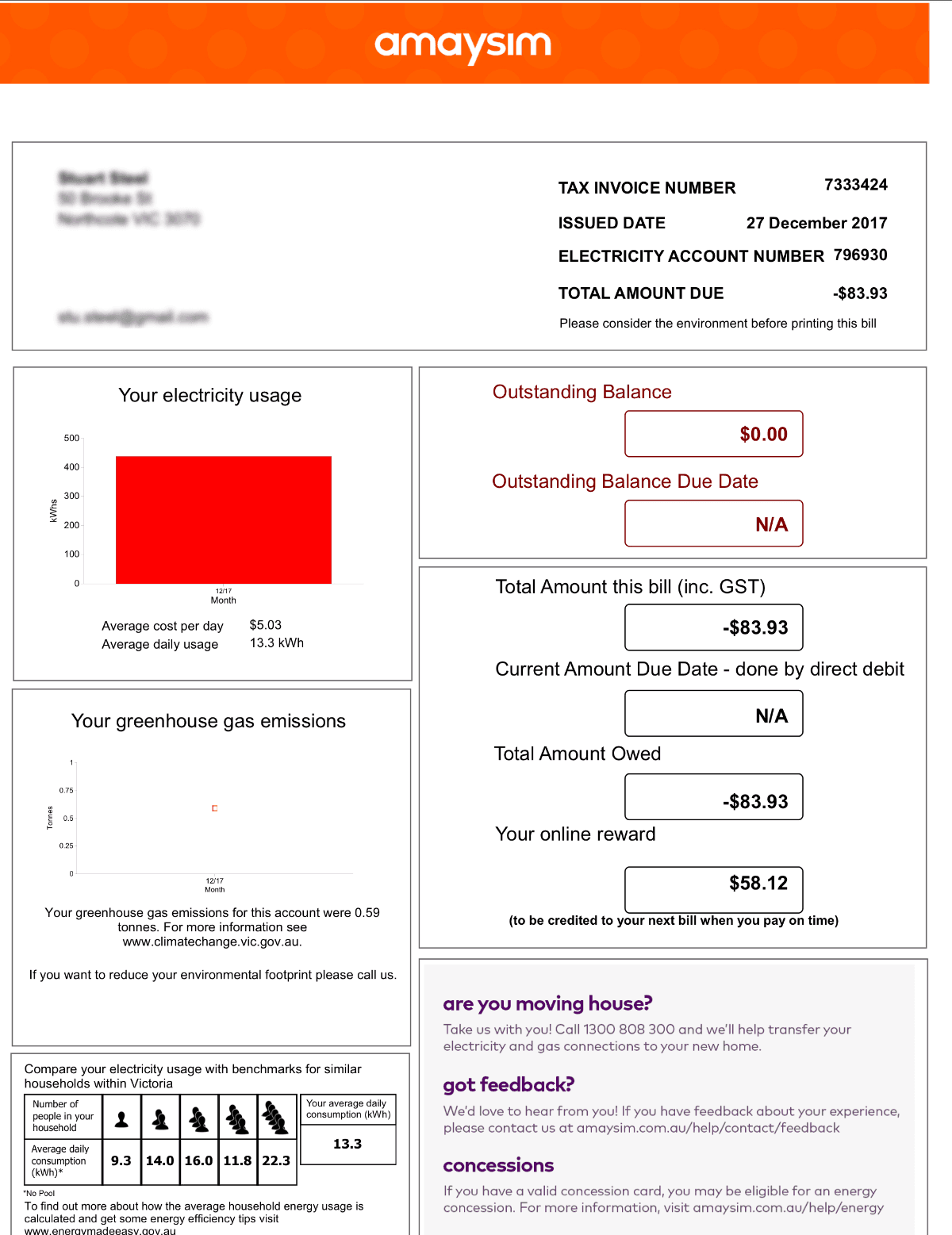
Post-paid electricity plans
Conventional energy billing is complex and confusing
amaysim's pre-paid electricity plans delivers…
Simplified billing
Consumption modeling in the app
Post-launch activities
Post-launch activities
Remote user testing
Remote user testing
Testing user perceptions with remote user testing
We tested product constructs with remotely recruited test subjects. Our different personas reacted to the plans in the following way
Pryce Hunter: Pryce liked the new plan simplicity (in principle) but wouldn't switch. They understand current plans and enjoyed the buzz of exploiting sign-up bonuses.
Pryce Hunter: Pryce liked the new plan simplicity (in principle) but wouldn't switch. They understand current plans and enjoyed the buzz of exploiting sign-up bonuses.
Bill Easy: Bill responded enthusiastically to the simplicity and transparency of the new plans. Less cognitive load and less maintenance would drive consumer choice.
Bill Easy: Bill responded enthusiastically to the simplicity and transparency of the new plans. Less cognitive load and less maintenance would drive consumer choice.
Sue Spicious: Sue liked the simplicity, but felt certain that there were hidden traps that they weren't seeing.
Sue Spicious: Sue liked the simplicity, but felt certain that there were hidden traps that they weren't seeing.
Positive responses
No bill shock: The predictable monthly billing and the pro-active consumption modelling were the best received feature
No bill shock: The predictable monthly billing and the pro-active consumption modelling were the best received feature
Why hasn't this happened sooner?: Users are generally much happier with their mobile phone bill than their energy bill
Why hasn't this happened sooner?: Users are generally much happier with their mobile phone bill than their energy bill
Bill smoothing: Users reported that they understood how energy roll-over worked, and that it was better to have predictable, consistent billing
Bill smoothing: Users reported that they understood how energy roll-over worked, and that it was better to have predictable, consistent billing
Areas of concern
This is too good to be true: Multiple test subjects said this. Essentially: "Why is an energy retailer trying to be nice to us?" Because this feedback was "positive" we tended to dismiss this sign of customer suspicion. Later testing suggests that this was a mistake.
This is too good to be true: Multiple test subjects said this. Essentially: "Why is an energy retailer trying to be nice to us?" Because this feedback was "positive" we tended to dismiss this sign of customer suspicion. Later testing suggests that this was a mistake.
But what are you doing with my money?: Some users expressed concern that amaysim was holding customer's money in credit. Once again customer suspicion could nullify the benefit of bill smoothing.
But what are you doing with my money?: Some users expressed concern that amaysim was holding customer's money in credit. Once again customer suspicion could nullify the benefit of bill smoothing.
User diaries
User diaries
We recruited 4 Victorian and 4 NSW customers for diary studies
Test subjects were incentivised to participate
Test subjects were incentivised to participate
NSW customers included free Smart Meter installation; This made the NSW experience much more complicated than the VIC experience. 2 of 4 subjects had some installation issues
NSW customers included free Smart Meter installation; This made the NSW experience much more complicated than the VIC experience. 2 of 4 subjects had some installation issues
Once the account was running the usage experience was easy for everyone.
Once the account was running the usage experience was easy for everyone.
Two of 8 subjects responded very positively to the plans. These subjects had previously experienced bill-shock and found budgeting hard.
Two of 8 subjects responded very positively to the plans. These subjects had previously experienced bill-shock and found budgeting hard.
The remaining subjects responded neutrally or mildly to the new plan. It had been a positive experience, but so had their previous post-paid energy plan experience
The remaining subjects responded neutrally or mildly to the new plan. It had been a positive experience, but so had their previous post-paid energy plan experience

Simplifying product pages
Responding to government regulation and user feedback
Simplifying product pages
Responding to government regulation and user feedback
Responding to customer feedback and government regulation
In the months after product launch the UX team responded to user feedback and changes to government regulation.
More product explanation needed: Users reported that they needed more than the original minimal detail to understand and trust the new energy plans
More product explanation needed: Users reported that they needed more than the original minimal detail to understand and trust the new energy plans
Government mandated reference prices: Government regulation attempted to regulate predatory market behaviour. Government reference prices were supposed to set a ceiling on retail prices, but didn't relate well to pre-paid subscription models.
Government mandated reference prices: Government regulation attempted to regulate predatory market behaviour. Government reference prices were supposed to set a ceiling on retail prices, but didn't relate well to pre-paid subscription models.
By the time this content was added the originally simple plans were looking information dense and daunting to read.
Progressive rounds of simplification
An initial round of simplification used iconography and background colours to reduce word count and improve structure. There was still a lot of repetitive content to read however.
An initial round of simplification used iconography and background colours to reduce word count and improve structure. There was still a lot of repetitive content to read however.
A final round of simplification restructured the plans page so that only one plan was shown at a time. This reduced the amount of content visible on the page and made it less daunting to read.
A final round of simplification restructured the plans page so that only one plan was shown at a time. This reduced the amount of content visible on the page and made it less daunting to read.
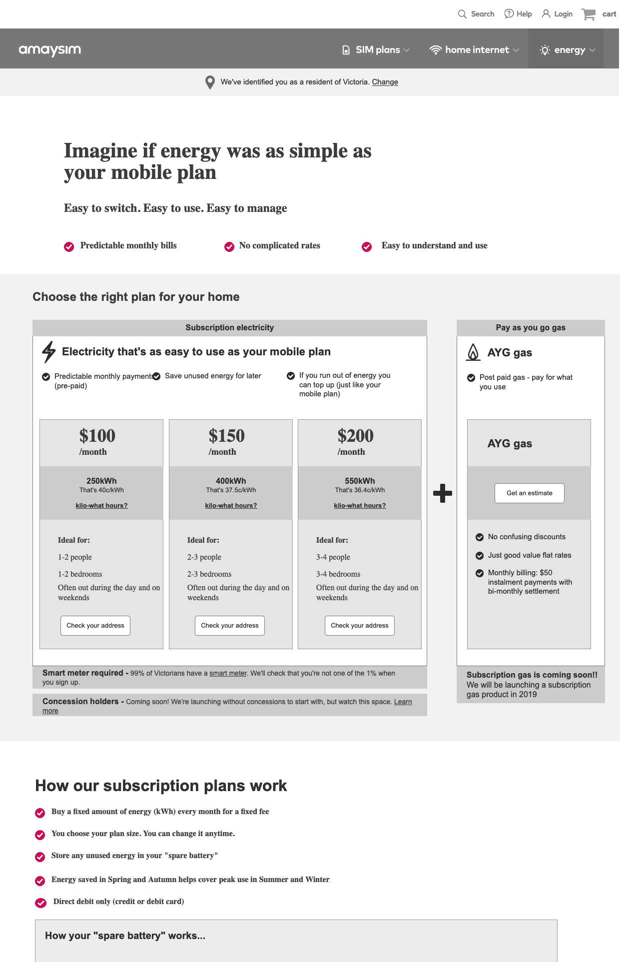
Plans page on launch date
On-launch plan cards were intentionally as simple and light as possible.
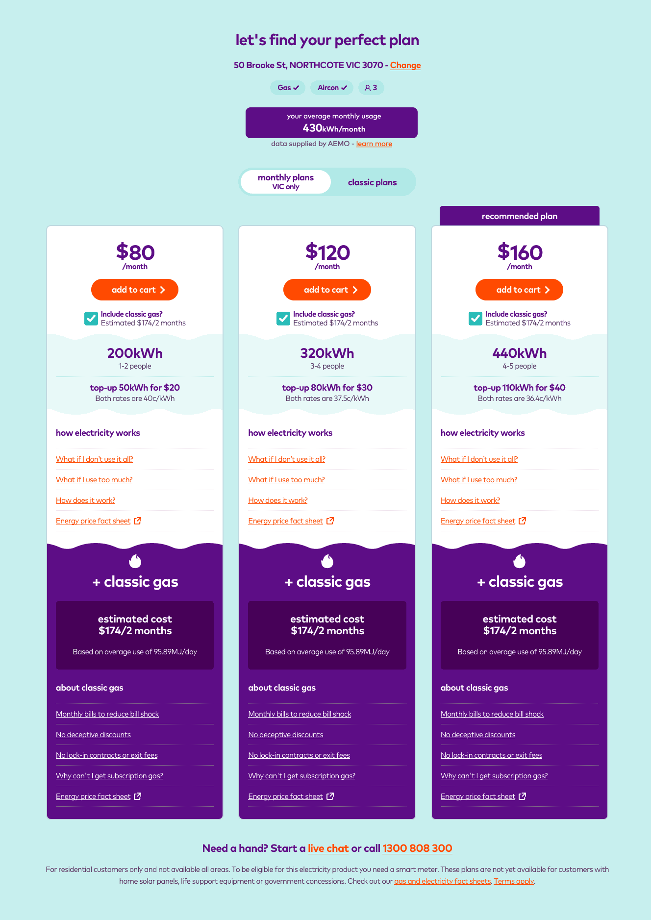
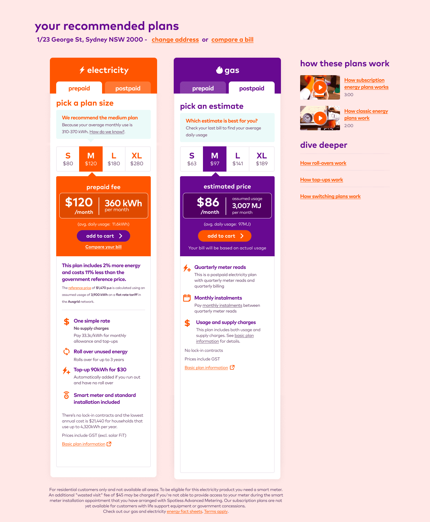
plans page after regulation compliance
New legal compliance requirements and more product explication resulted in too much copy.
Reference prices are framed for post-paid pricing models, not pre-paid ones
Reference prices are framed for post-paid pricing models, not pre-paid ones
Initial plan page simplification
Re-ordering and restructuring content made the page significantly simpler, but there was still a lot of repeated content.
Final plan page simplification
This final design empowered plan recommendation and only showed one plan at a time, reducing content repetition.
Modelling customer shopping behavior
Understanding user confusion
Modelling customer shopping behavior
Understanding user confusion
Disappointing sales figures
In the months following the new product launch sales figures were disappointing. There was a clear gap between the consistently positive feedback we had gathered in user testing and the fact that amaysim was selling more post-paid plans than pre-paid ones.
This was compounded by the fact that amaysim was not investing in advertising, or further development of the product.
Modelling the consumer comparison and purchase experience
While validating the most recent designs with remotely recruited test subjects I devised a new test to examine how users compared energy plans.
1
Testing product rules: Users were quizzed on their response to the product values of simplicity and pricing transparency
1
Testing product rules: Users were quizzed on their response to the product values of simplicity and pricing transparency
2
Testing interface comprehension: After users understood the product offering they were invited to use and interpret the user interface
2
Testing interface comprehension: After users understood the product offering they were invited to use and interpret the user interface
3
(New) Comparison of competing energy plans: Users were invited to choose from three competing real plans
3
(New) Comparison of competing energy plans: Users were invited to choose from three competing real plans
Test outcomes
I had assumed that the two prior steps of the test (explaining predatory industry behaviour and demonstrating the value of pre-paid plans) would be heavily prejudicial towards users choosing the amaysim pre-paid plan. Instead, 80% of test subject chose a competing post-paid plan.
The unexpected result could be explained by observed test subject behaviour
1
Simpler product design did not result in a simpler user experience: While pre-paid plans were easier to understand in isolation, it was actually more complicated to compare them against post-paid plans with conventional pricing models.
1
Simpler product design did not result in a simpler user experience: While pre-paid plans were easier to understand in isolation, it was actually more complicated to compare them against post-paid plans with conventional pricing models.
2
Users took shortcuts to evaluate value: Users were not prepared to do the complex maths to compare complicated plans, instead relying on high level anchor statements, even if they were meaningless or comparing different things. Plan B was perceived as being cheaper than Plan C, when it was actually slightly more expensive.
3
Users were swayed by acquisition pricing: Users chose "cheaper" prices even when they were warned that sign-up prices for post-paid plans would rise markedly later. Users distrusted the brand and industry too much to believe that pre-paid pricing wouldn't rise later too.
3
Users were swayed by acquisition pricing: Users chose "cheaper" prices even when they were warned that sign-up prices for post-paid plans would rise markedly later. Users distrusted the brand and industry too much to believe that pre-paid pricing wouldn't rise later too.
Comparing energy plans: Test assets
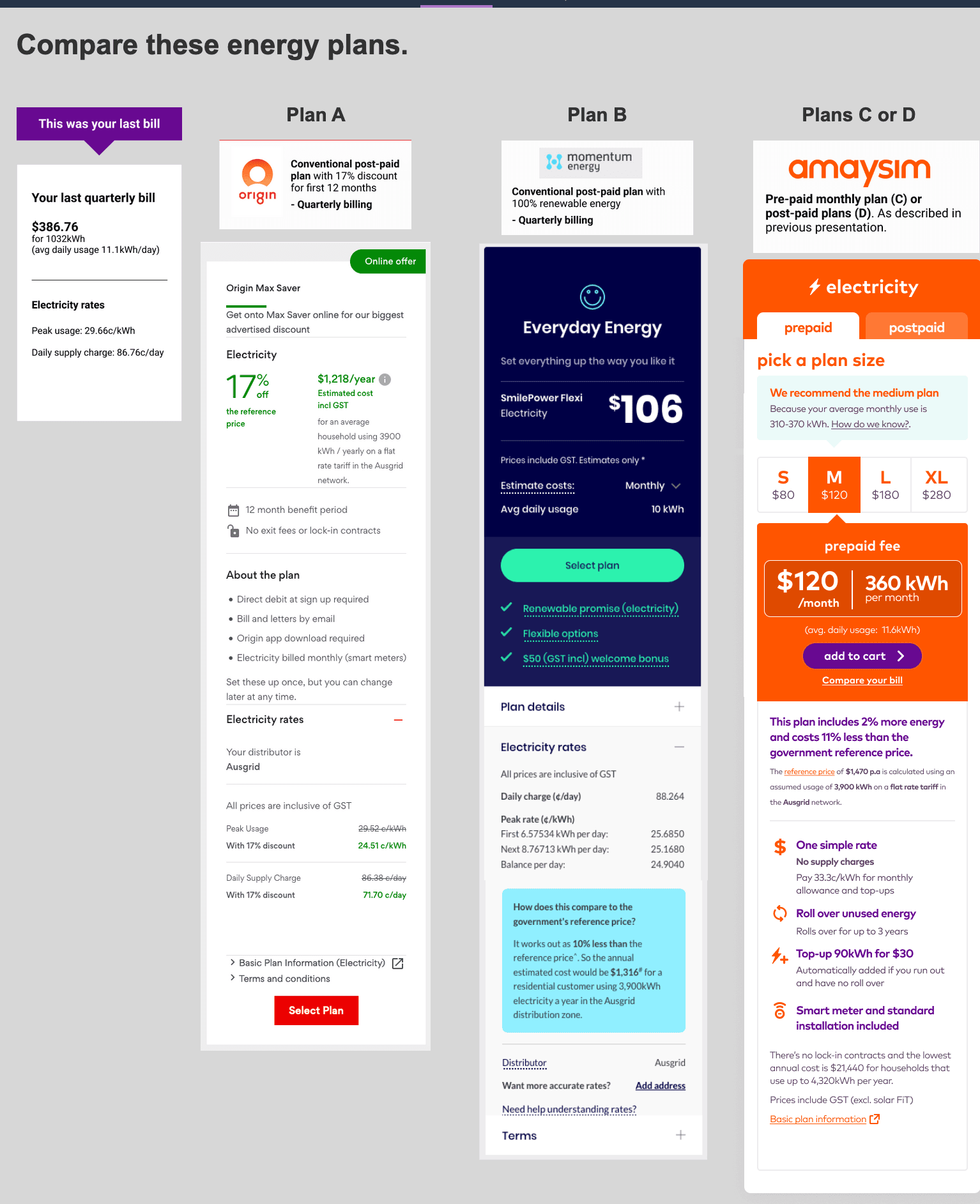
Anchor statements are circled in yellow
Anchor statements are circled in yellow
Project outcomes
Project outcomes
Outcomes
Outcomes
amaysim sells its energy arm to AGL
Sixteen months after launching it's pre-paid energy plans amaysim sold its energy arm to AGL. This process had stalled, and then terminated, product development since amaysim had stopped investing in energy 12 months before the deal was announced.
UX learnings
While the amaysim product and design team had ostensibly designed a "better" and "more user friendly" product, commercial results (though complicated by other factors) contradicted this. This was a very important lesson for me.
1
Beware building a better mousetrap: A new "improved" product needs to be experientially simpler and better in all contexts to succeed
1
Beware building a better mousetrap: A new "improved" product needs to be experientially simpler and better in all contexts to succeed
2
Beware product group think: With so much bad consumer experience, and a product team incentivised to predict positive outcomes, it was easy to believe that success was guaranteed
2
Beware product group think: With so much bad consumer experience, and a product team incentivised to predict positive outcomes, it was easy to believe that success was guaranteed
3
Test design is critical: Testing the wrong thing (or the right thing in the wrong way) can badly skew results. At some point testing's goal should be to invalidate the proposition.
3
Test design is critical: Testing the wrong thing (or the right thing in the wrong way) can badly skew results. At some point testing's goal should be to invalidate the proposition.
4
Changing user behaviour often takes time and money: Further product development may have been able to better address user concerns. More marketing, and early mover referrals may have been able to shift consumer cynicism and suspicion
4
Changing user behaviour often takes time and money: Further product development may have been able to better address user concerns. More marketing, and early mover referrals may have been able to shift consumer cynicism and suspicion
Other case-studies
Other case-studies

UX + UI design,
Copy writing

User research + testing,
UX design

Business analysis,
Product ownership,
UX design, Coding,
User documentation
WANT TO get in touch?
Let’s chat
Thanks for checking out my work.
I believe in rapid iteration, early sharing, and learning from mistakes. I believe that design is about solving problems, not creating art. Good design aims to make small, meaningful improvements to people’s daily lives.
If you want to work with me, or learn more about my design process, don’t hesitate to get in touch.
Copyright © 2024 Stuart Steel
WANT TO get in touch?
Let’s chat
Copyright © 2024 Stuart Steel