
Circle In
Redesigning and launching Circle In’s new app in just 3 months
Role
UX lead
year
2024
project length
58 days
deliverables
UI designs, prototypes,
Email
+ MS Office
template designs + code
final productS
Web app

Project Summary
Circle In needed to design AND build it's new app experience in only 3 months. I came on board on day 1 to help them achieve this goal, and to significantly improve their product in the process.
DELIVERED in less than
58 working days
Starting date: 03/06/2024
Starting date: 03/06/2024
Launch date: 09/09/2024
Launch date: 09/09/2024
Working 4 days per week
Working 4 days per week
Design
deliverables
User sign-up funnel
User sign-up funnel
App experience design
App experience design
Email and MS Office notification designs
Email and MS Office notification designs
Production ready code for emails and MS Office cards
Production ready code for emails and MS Office cards
Collaborative leave plan tool
Collaborative leave plan tool
project
Outcomes
Launched on time: Customers began migrating to the new app in September
Launched on time: Customers began migrating to the new app in September
Increased user engagement: In the first quarter user engagement jumped by 230%
Increased user engagement: In the first quarter user engagement jumped by 230%
Improved user conversion: User signup funnel jumped from 77% to 94% efficiency
Improved user conversion: User signup funnel jumped from 77% to 94% efficiency

Put down your smartphone!
This case-study needs a bigger screen to be seen properly.
Want design shots and project details?
Please come back when you have a laptop or tablet.
Challenge
Who are Circle In
Circle In is a digital-first employee benefits platform for enterprise organisations, providing on-demand support to corporate workers balancing work with caregiving and/or parenting. It was created by Jodi Geddes and Kate Pollard, inspired by their own difficult experience of parenting while working in corporate environments.
Business goals
Circle In's app experience was aging. More importantly user engagement was low, and this was leading to difficult conversations with their clients, corporate HR teams. CI wanted to refresh their app, and most importantly improve user engagement, the effectiveness of their push notifications and the quality of value they could report to customers.
An ambitious timeline
I joined the CI team on the 2nd of June 2024 to discover an ambitious goal and timeline. The leadership team had set a goal of redesigning and rebuilding their main app in just 3 months. On my very first day I started my design work, the same day that the dev team started to write code.
This seemingly impossible task was made possible because of the following pre-existing assets:
A tech stack from a similar app
Content from the original app
Some conceptual design work generated by a previous designer
These pre-existing assets did not diminish the challenge faced by the design and dev teams.
60 days worked in June - September
June
July
August
September
June
July
August
September
Team
Product: I worked closely with the two person product team. Their clarity, support and flexibility was first rate.
Dev team: Circle In had a 3 person dev team. They were building the application even while I designed it. Naturally this required a lot of collaboration and negotiation. Dev team members were particularly effective at sense checking and contextualising my designs - feedback that was invaluable.
Content: Circle In had a 3 person content team. I worked with the head of the Content Team to mature and finalise the site taxonomy, and was well served by the rest of the team when I needed content to shape and mature design ideas.
Working with constraints
Time constraints
The most significant challenge in this project was working with such tight time constraints and having no lead time ahead of the development team. While much has been written about ideal design practices and workflows, this scenario required a much more pragmatic, rapid and flexible approach.
Minimal opportunities for UX research
Minimal opportunities for testing and validation
Minimal opportunities for testing and validation
Minimal time for design file grooming
Design strategies in response
Take advantage of inside knowledge and pre-existing test assets – but form your own conclusions based on past experience
Guerrilla test where you can, including using internal test subjects; rely on design heuristics at all other times
The dev team is one of your best sense-checkers – use them
Be responsive to dev team requests: bend where you can, then bank that good will to make demands of your own when you need to
Use interactive prototypes to communicate and test concepts, and to sense-check your designs
Always move forwards: Don’t get stuck on a problem; Don’t quest for perfection; Always remember the larger user goals
Negotiating MVP
Throughout this process, design ideas were shared early and often with the development team. With a development background I was able to design with development costs in mind. Where designs were still too expensive I was able to work with the BA and the tech leads to identify solutions that met MVP goals while minimizing time costs.
research
User interviews
User interviews with self-identified site users were extremely positive. Users reported high value from the content and how much it had helped their personal caring journey. In particular they noted how engaging the True Stories were (personal testimonies from other people). It's important to note that these users were biased towards being super-users.
Site analysis
Only a small percentage of potential users ever signed up to use the resource
The sign-up funnel did not have a great conversion rate ( approx. 75%)
Repeat usage rates within the application were low.
Reviewing the existing app
The existing site failed to explain, introduce or promote itself either in its sign up funnel or on its main dashboard screen
Navigation within the site was not very intuitive, and typically there were several clicks and user decisions required before valuable content could be found. It was likely that many new users were failing to engage with content before leaving the site, and then failed to revisit again.
The visual design was poor, dated and not very engaging
Push emails were poorly designed. Content was poorly structured, not very engaging and poorly personalized. Visual design was not very professional or engaging either.

Engaging with busy users
Personal experience working in corporate environments, the site traffic analysis and user testimonials led me to forming the following working assumptions:
The product does have real value: Engaged users found it valuable and visited repeatedly to access it
Only a small percentage of the potential user base became engaged users. These engaged users were oversampled in the user interviews
The site’s sign-up funnel was failing to effectively promote and explain its own value to new users. As a result it was failing to convert new users effectively
New site visitors frequently had disappointing first experiences. Poor first experiences, naturally, did not invite repeat visits
The low level of user engagement described in the site analytics was a real challenge to CI’s business model and value claims they make to their customers.
From personal experience, I assumed that corporate employees were typically time poor, and already burdened by multiple compliance and administrative burdens. HR programs can often be perceived as being part of this compliance and administrative burden, rather than being a benefit. This is in part due to the fact that many of these services are poorly designed for their end-users, and the time cost and cognitive load of learning and then using these tools often conflicts with other time commitments.
Design
Design goals
Key priorities
1
Outward facing comms and sign-up funnels must always be positive, visually confident and promoting the CI value proposition
2
Outward facing comms and live events should drive users back to the site - increasing site engagement, and the chance of repeat activities
3
The sign-up funnel must be able to register new users efficiently
4
The app experience must deliver value immediately: Content personalization means users don’t need to search for relevant content
5
The site must be very easy to use. Visually it must be sophisticated enough to gather attention and communicate credibility (relative to its corporate peers and competitors)
6
Deliver value to where your users already are: Relevant content to be pushed to users via email and MS Teams
7
Design for desktop first: Unlike most projects 90%+ of site usage is on desktop devices
8
Close collaboration with the development team is vital. Design and development has to be in constant conversation to meet time goals

Site taxonomy design
Personalizing user experience
Reviewing and refining the site taxonomy
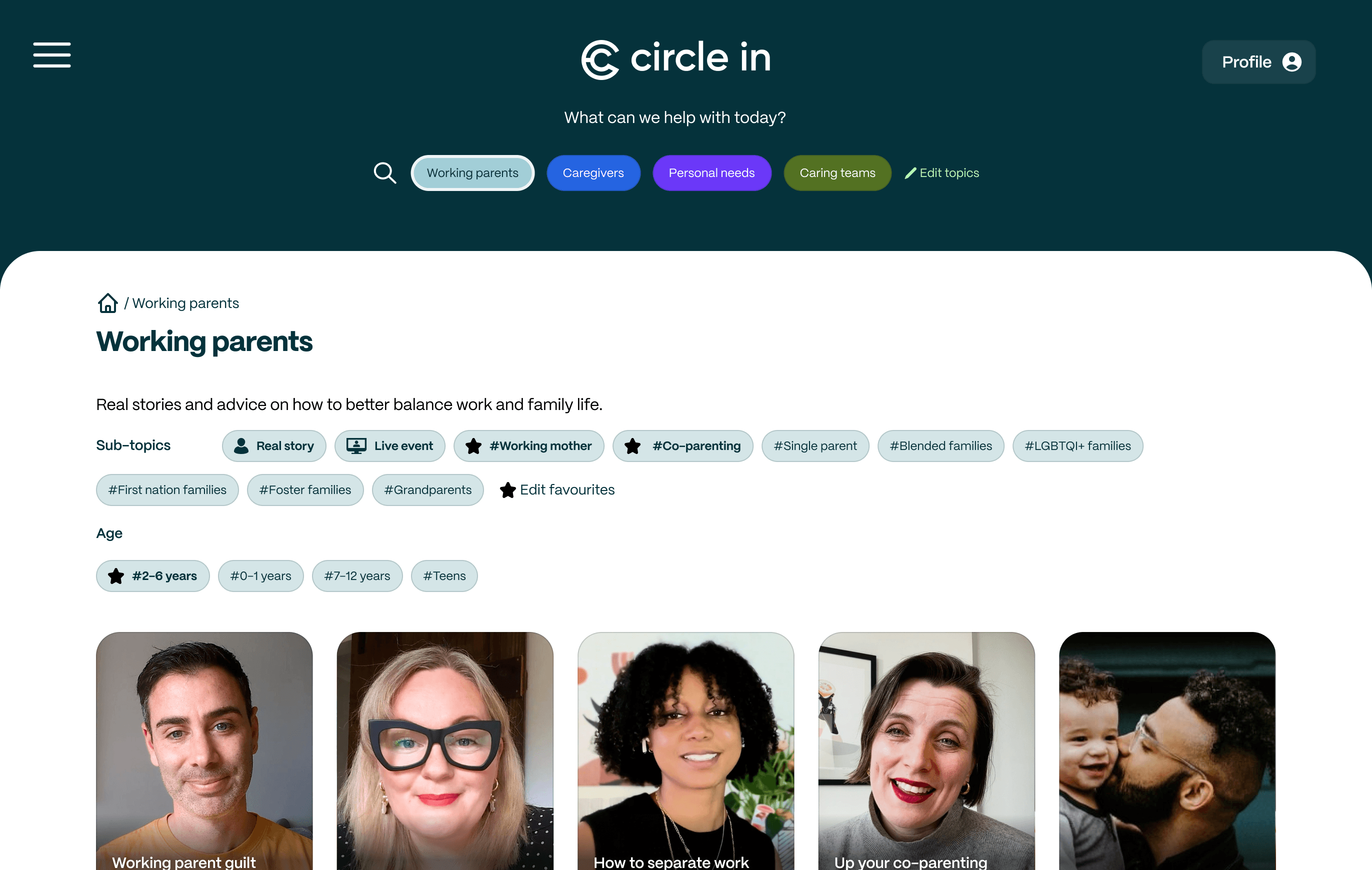
My first task was working with the Head of Content to design a new taxonomy for the site’s content. The taxonomy consisted of 5-7 subject topics, each covering a different user scenario. Each topic was broken down into a number of sub-topics for more.
Functional considerations for the site taxonomy
It quickly became apparent that the taxonomy would drive critical user experiences:
Effective content recommendations: Users should not need to search to find valuable content
Intuitive searching and browsing: Users must find it easy to search for valuable content
Push notifications that invite click through: Emails and MS Office alerts should publish relevant and valuable content
Collecting actionable user data: Collected user data must be useful, must map to the taxonomy and drive both user and business benefits
All of these tasks needed to be designed before the taxonomy could be fully evaluated. After a first draft of the taxonomy was drawn up I pivoted to developing initial designs for the onboarding and content browsing designs. As other user experiences were designed the taxonomy would be sense checked again, matching it against both the designs and the maturing content database. This sort of pivoting was a common pattern through the entire design process.
Favourite topics
Parents-to-be
Select the sub-topics for parents-to-be that interest you
Real stories
Live events
#Preparing for new baby
#Working while pregnant (Safety)
#Supporting pregnant partner
#New baby
#IVF
#Adopting
#Fostering
Parents-to-be
Select the sub-topics for parents-to-be that interest you
Real stories
Live events
#Preparing for new baby
#Working while pregnant (Safety)
#Supporting pregnant partner
#New baby
#IVF
#Adopting
#Fostering
Working parents
Working parents
Caregivers
Caregivers
Personal needs
Personal needs
Caring teams
Caring teams
Interactive prototype
A user can select the life stages that are relevant for them
A user can select the life stages that are relevant for them
By selecting additional sub-topics a user can receive even more specific information that meets their needs
By selecting additional sub-topics a user can receive even more specific information that meets their needs
Unselected life stages are shown in a collapsed state
Unselected life stages are shown in a collapsed state
Site taxonomy design
Validating through user testing
Sense checking taxonomy design with simple prototypes
Once initial content browsing designs were completed I built some quick non-interactive prototypes to demonstrate how content would be filtered by the taxonomy. This elicited immediate feedback that led to changes in application logic.
The prototype was then extended and tested further by importing real world. This demonstrated that the concept worked but revealed weaknesses in how the new taxonomy was being applied to real world content. This information was fed back to the content team who then adjusted how they were applying taxonomy tags to their content.
Testing taxonomy design with tree tests
Later in the design process I ran tree tests with 6 test subjects to validate the efficacy of the taxonomy. This test required each user to find relevant content using the taxonomy and 15 different search challenges. The tests identified the following:
Confirmed the general validity of the designed taxonomy
Identified several taxonomy labels that needed further refinement.
The critical plan information (price and data) are prominently displayed. Supporting plan inclusions are stacked neatly beneath.
Identified several user scenarios which didn’t map clearly to a single taxonomic tag. Articles covering these scenarios were then tagged to several different tags to aid discoverability
Sign-up funnel
Selling the user proposition
Promoting the Circle In value proposition
One of my first goals when redesigning the sign-up flow was to highlight the need for communicating and selling the Circle In value proposition. While I raised this verbally with the product and content teams I didn’t have time to wait for them to respond and supply content. My strategy was to write and insert my own content, not expecting it to be perfect or final, but that it would demonstrate the requirement and challenge for the content team to replace it with something better.
FIRST SCREEN OF SIGNUP FUNNEL
Original design
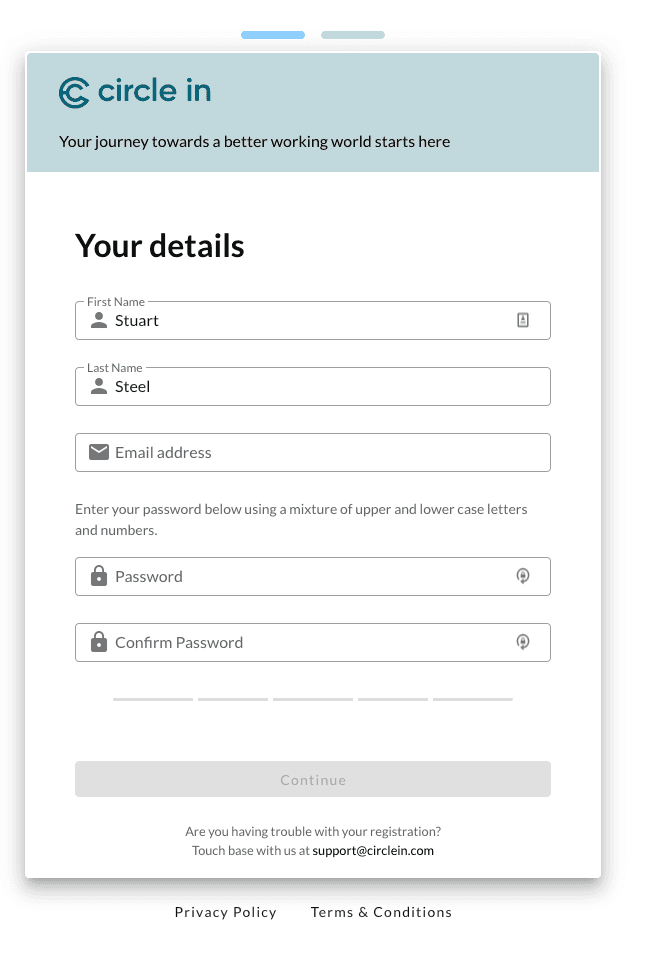
Updated design

New title and subcopy explains who Circle In is for, and what it’s value is if you join
New title and subcopy explains who Circle In is for, and what it’s value is if you join
Embedded video explains the purpose and benefit of Circle In, while demonstrating content
Embedded video explains the purpose and benefit of Circle In, while demonstrating content
What does Circle In do?
There is no explanation of what Circle In will offer to users who join up.
What does Circle In do?
There is no explanation of what Circle In will offer to users who join up.
Sign-up funnel
Collecting actionable user data
Sign-up funnel
Collecting actionable user data
The collection of information is neither intrusive or demanding - it mustn’t prevent users from completing the signup
The collection of information is neither intrusive or demanding - it mustn’t prevent users from completing the signup
All information collected needed to high value and actionable, mapping appropriately to the site taxonomy
All information collected needed to high value and actionable, mapping appropriately to the site taxonomy
Medical privacy laws needed to be considered. It was important not to collect sensitive personal data
Medical privacy laws needed to be considered. It was important not to collect sensitive personal data
Medical privacy laws needed to be considered. It was important not to collect sensitive personal data
To reduce cognitive load, more detailed questions were only asked after the user had identified their relevance
Medical privacy laws needed to be considered. It was important not to collect sensitive personal data
To reduce cognitive load, more detailed questions were only asked after the user had identified their relevance
Directing new, onboarding and existing users in the app
Support for every life stage
No matter your generation or caregiving responsibilities
Tick all that’s relevant.
That way we’ll recommend the content that’s most useful.
I want to support my personal wellbeing
I want to support my personal wellbeing
I'm preparing to welcome a new child
I’d like content about...
Preparing for a new baby
Working while pregnant (safety)
Supporting pregnant partner
IVF
I'm preparing to welcome a new child
I’d like content about...
Preparing for a new baby
Working while pregnant (safety)
Supporting pregnant partner
IVF
I'm a working parent
I'm a working parent
I'm caring for a loved one
I'm caring for a loved one
We will never share this information with anyone else without your permission. Refer to our privacy policy for more information.
You will be able to update your profile later.
Go back
Start using Circle In
Interactive prototype
Selected scenarios expand to show detailed sub-topics
Note how the questions are framed as “an interest in” rather than asking specifically for personal medical data
Selected scenarios expand to show detailed sub-topics
Note how the questions are framed as “an interest in” rather than asking specifically for personal medical data
New user can identify what life stages are relevant for them. Each life stage maps to a top level taxonomy tag
New user can identify what life stages are relevant for them. Each life stage maps to a top level taxonomy tag
Web app design
Home page design
Web app design
Home page design
Surfacing valuable content via user personalization
New users only have a limited attention window. In that limited time the app needs to demonstrate real value. Content customization, driven by the taxonomy and user data, was implemented in two different ways to deliver this:
Customization of primary site navigation
Customization of primary site navigation
Prioritizing and ordering articles via user data and user input
Prioritizing and ordering articles via user data and user input
Making value immediately relevant on the home page
The primary site navigation is customized to match the user personas identified during sign-up:
Non-relevant navigation options are hidden. Hidden content can still be found via search or hamburger navigation, and user personalization can be edited later
Non-relevant navigation options are hidden. Hidden content can still be found via search or hamburger navigation, and user personalization can be edited later
Relevant content is surfaced by algorithms that surface articles tagged to match user interest
Relevant content is surfaced by algorithms that surface articles tagged to match user interest
Customising home page content for each user
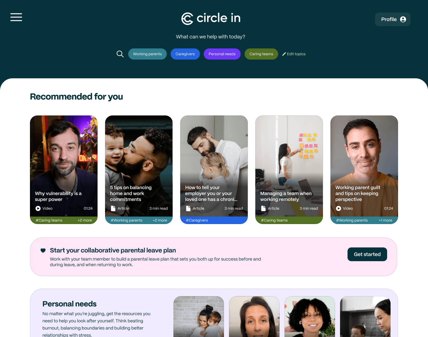
Only 5% of site users search by keyword: Search function is present but low priority
Only 5% of site users search by keyword: Search function is present but low priority
Users can edit the preferences they set during onboarding by clicking on the "Edit tools" link
Users can edit the preferences they set during onboarding by clicking on the "Edit tools" link
Recommended content driven by user preferences and site taxonomy
Recommended content driven by user preferences and site taxonomy
Top level topic links match user scenarios checked during onboarding
Top level topic links match user scenarios checked during onboarding
Web app design
Personalized content presentation
Web app design
Personalized content presentation
Driving content relevancy in the browse experience
When a user browses a site containing hundreds of individual articles it’s vitally important that find it easy to discover intuitive content. Several design iterations were developed to drive this experience, with only the MVP being implemented before the launch date.
Browsing content (MVP)
Browsing for specific content (MVP)
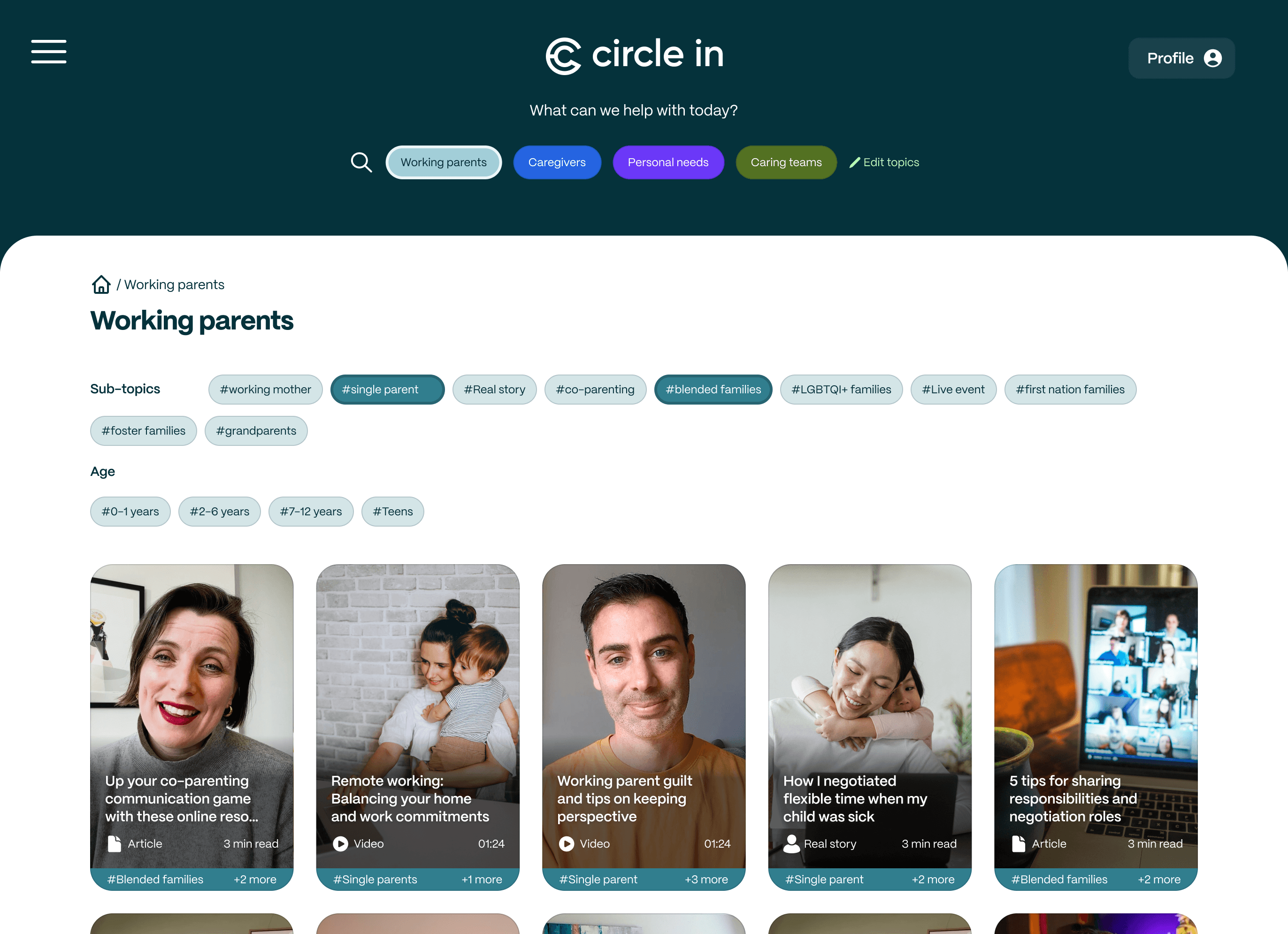
All subtopics for selected topic are shown
All subtopics for selected topic are shown
Content on page is ordered to lift favourite sub-topics to the top of the page
Content on page is ordered to lift favourite sub-topics to the top of the page
Select one or more sub-topics to re-order page content
Articles matching selected sub-topics are displayed first
Select one or more sub-topics to re-order page content
Articles matching selected sub-topics are displayed first
Favourite sub-topics are not highlighted or prioritised
Favourite sub-topics are not highlighted or prioritised
All sub-topics are shown in the list - improving doscoverabiltiy
All sub-topics are shown in the list - improving doscoverabiltiy
Edit sub-topics to add more favourites - but discovering new sub-topics is poor and non-intuitive
Edit sub-topics to add more favourites - but discovering new sub-topics is poor and non-intuitive
Increasing user engagement
Increasing user engagement
Increasing user engagement
Arguably the most critical requirement of the new site design was to increase user engagement. Low engagement was the principle concern expressed by clients. My approach to improving this metric took three forms:
Increasing the priority and discoverability of Real Stories
Increasing the priority and discoverability of Real Stories
Integrating Live Events into the app experience
Integrating Live Events into the app experience
improving the effectiveness of Push Notifications to drive traffic back to the main app.
improving the effectiveness of Push Notifications to drive traffic back to the main app.
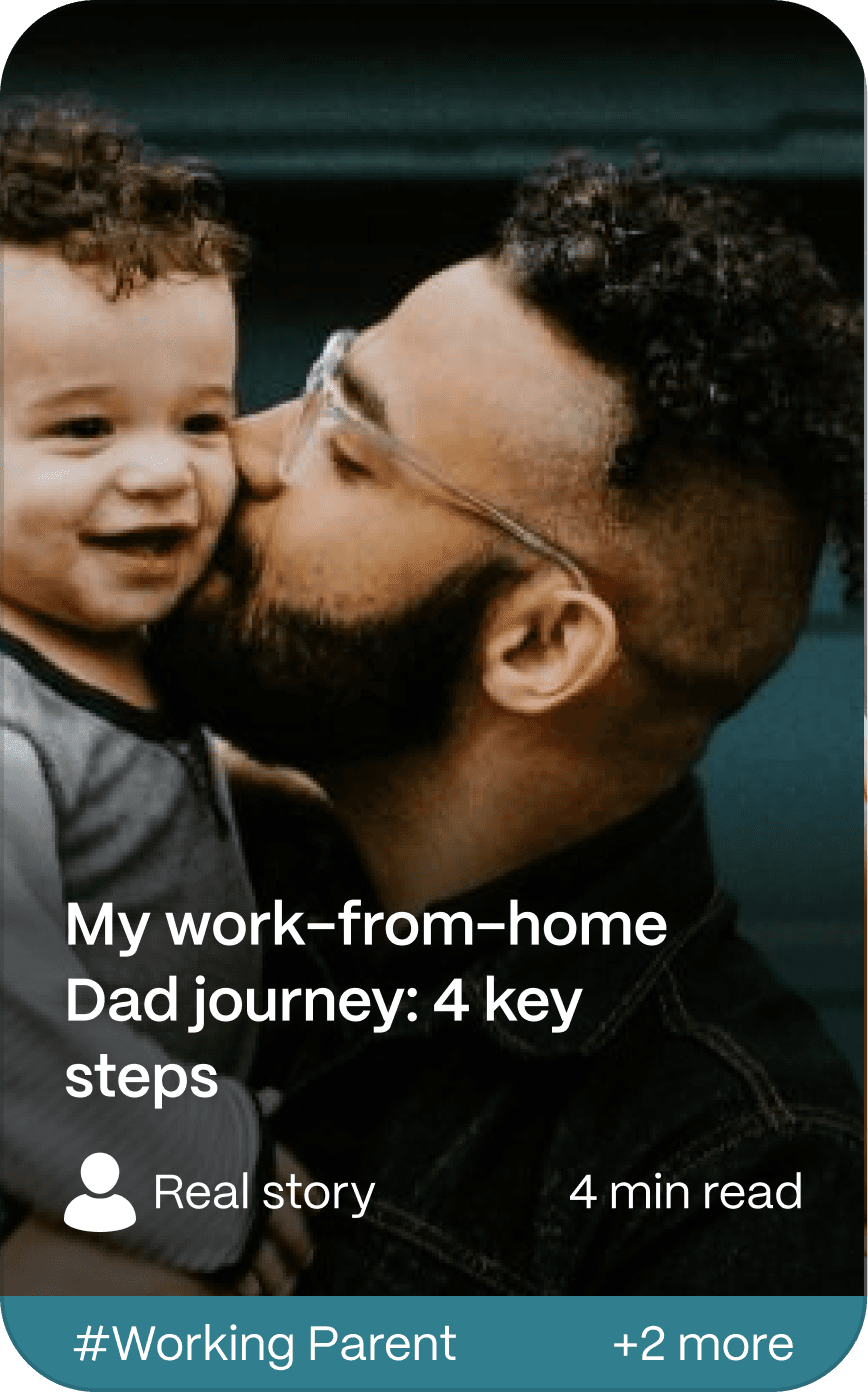
Prioritizing Real Stories
User interviews reported that Real Stories were almost universally considered the most valuable form of site content. In the original site it was positioned in its own area, so not properly integrated with the other forms of content. My approach was to integrate Real Stories into the standard topic areas, but add tools and presentation to make this content prominent and easy to find.
Integrating Live Events into the Platform
Circle In's users valued CI's Live Events second only to the Real Stories. Historically Live Events ran completely independently of the app. Bringing these events into the app experience would increase user engagement, and hopefully lead to more users exploring the site's content.
Improving Push Notifications
CI was highly reliant on email push notifications to draw users back to the main app. Review of these comms showed multiple critical flaws. A wholesale redesign of emails, and the addition of MS Teams notifications should produce significant improvements.
True Story and Live Event card design
Real Stories and Live Events are presented in a "Hero" tabset on the home page
Real Stories and Live Events are presented in a "Hero" tabset on the home page
Real Stories and Live Events get their own content cards
Real Stories and Live Events get their own content cards

Prioritizing most valuable content in content indexes
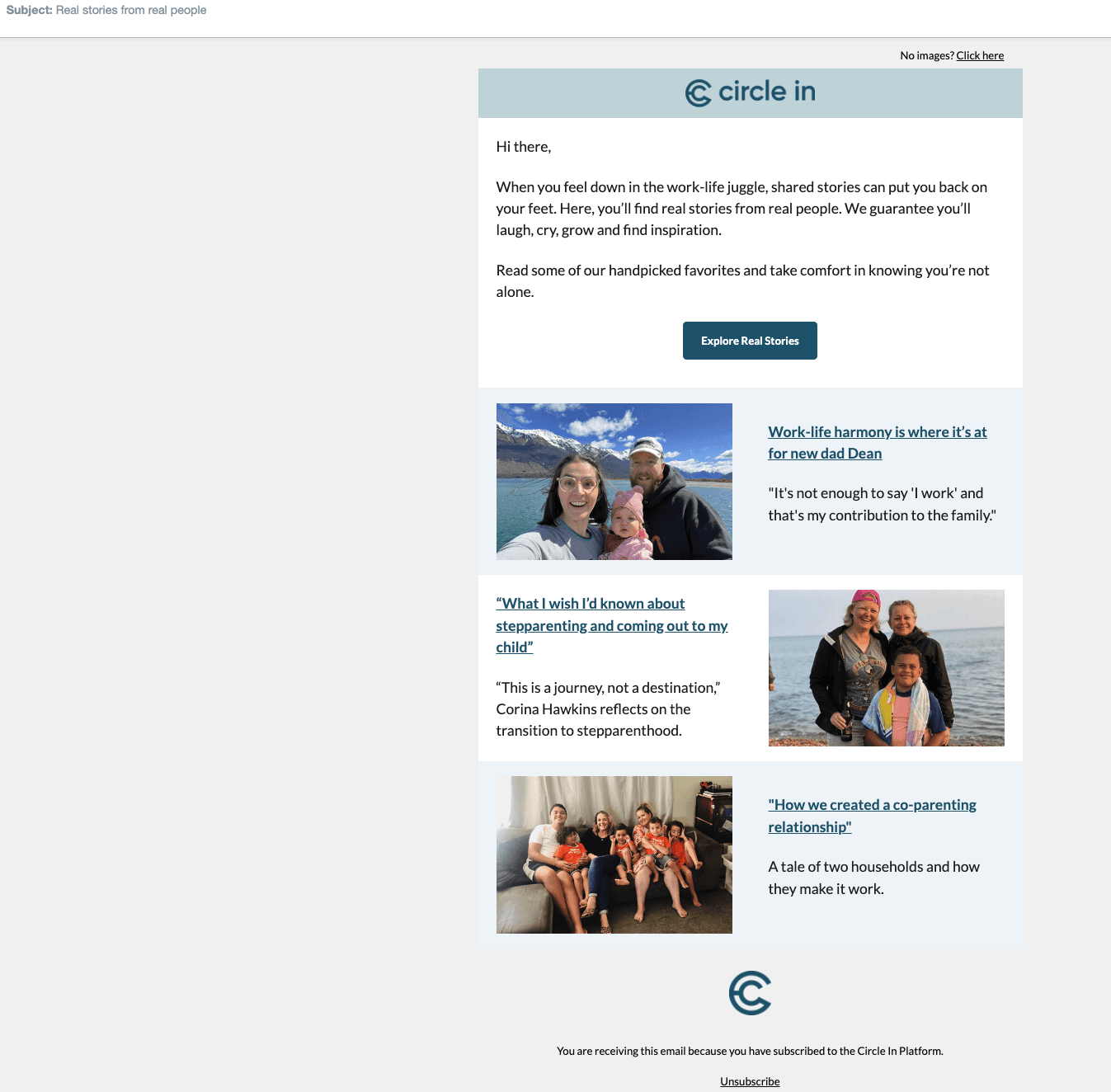
Promoting Real Stories & Live Events on the Home Page
Real Stories
No matter what you’re juggling, you can be sure that someone else has experienced it too. Our Real Stories are shared by real Circle In users.

Don't sweat the small stuff. My story
Real story
#Working parent

How ADHD daignosis changed my adult life
Real story
#Neurodivergence

Third time lucky. My own IVF story
Real story
#IVF
We have to remember: We're still a team
Real story
#Co-parenting
Real Stories
Live events
Real Stories
No matter what you’re juggling, you can be sure that someone else has experienced it too. Our Real Stories are shared by real Circle In users.
Don't sweat the small stuff. My story
Real story
#Working parent
How ADHD daignosis changed my adult life
Real story
#Neurodivergence
Third time lucky. My own IVF story
Real story
#IVF
We have to remember: We're still a team
Real story
#Co-parenting
Real Stories
Live events
Interactive prototype
Real story and live event articles are given highest priority
Real story and live event articles are given highest priority
Favourite sub-topics are bolded and placed at the front of the list
Favourite sub-topics are bolded and placed at the front of the list
Email template design
Email template design
Emails drive engagement with Circle In Users
Email notifications are Circle In’s primary tool for reaching out to their user base. Emails act to push value to their users, and drive user traffic back to the app. As such email design is very important.
Emails need to be easy to read, structured to present value propositions clearly at the top of the page, and designed to stand out in a busy inbox.
Campaign monitor email templates for campaign emails
The Campaign Monitor template needed to be delivered with the WYSIWYG tool rather than with custom HTML. This imposed a number of design constraints.
Most importantly the content structure had to be rewritten to better promote the content that provides user value by better page structure and typography.
Coding a HTML template solution for the dev team
As I had previous experience coding HTML emails (which are quite different than modern web pages) I coded my designs and delivered designs and templates to the dev teams. This gave the team a significant efficiency boost that helped them meet their own delivery goals.
Simple and elegant account management screen
Leading with placeholder text: Very low engagement
Leading with placeholder text: Very low engagement
It’s not immediately clear how this secondary content relates to the main email proposition
It’s not immediately clear how this secondary content relates to the main email proposition
Typography is universally weak
Typography is universally weak
Text content is unstructured and all the same small font: Close reading is required to extract user value
Text content is unstructured and all the same small font: Close reading is required to extract user value
In need of a pick-me-up?
Circle In
To:
Nicola Collins
Simple and elegant account management screen
In need of a pick-me up?
Circle In
To:
Nicola Collins
No images? Click here

Need some relief from your work-life juggle?
Sharing real life stories can put you back on your feet
On Circle In you will find real life stories from real people. We guarantee that you will laugh, cry, grow and find inspiration.
Explore real stories
Here are some of our favourite stories...
Work-life harmony is where it’s at for new dad Dean
“It’s not enough to say ‘I work’ and that’s my contribution to the family.
“What I wish I’d known about step-parenting and coming out to my child”
“This is a journey, not a destination” Corina Hawkins reflects on the transition to step-parenthood.
“How we created a co-parenting relationship”
A tale of two households and how they make it work.
You are receiving this email because you have subscribed to the Circle In platform.
Unsubscribe
© 2024 Circle In
Stronger branding in the banner
Stronger branding in the banner
Hero image increases visual engagement
Hero image increases visual engagement
Stronger typography and tighter content increases user engagement and improves scannability
Stronger typography and tighter content increases user engagement and improves scannability
Article subheading separates and contextualises secondary content
Article subheading separates and contextualises secondary content
MS Teams card design
MS Teams card design
Engaging with users inside MS Teams
The new app needed to integrate with MS Teams because that is where so much communication and audience activity is in many corporate environments. The challenge was how to use the tools to create distinctive and compelling communications that stand out in a user’s feed of Teams messages.
Designing compelling cards
Reviewing MS teams cards from other platforms suggested they were are all very similar - grey, utilitarian and lacking strong typographic structure.
I set about redesigning Circle In’s cards with the following goals in mind:
Cards should have a clear information hierarchy, promoting the central user value (the title of the article being promoted)
Cards should have a clear information hierarchy, promoting the central user value (the title of the article being promoted)
Cards should have effective branding
Cards should have effective branding
Cards should be visually striking to compete effectively for user attention
Cards should be visually striking to compete effectively for user attention
Delivering a code solution to developers
I was able to develop the design by exploring MS’s card design tool. This allowed me to understand and exploit the platform’s feature set (taking advantage of background images to inject colour). When a final design was completed I knew that it was implementable, and was able to export the JSON that encoded it. This helped the dev team to implement this feature quickly.
Original responsive card design
Updated responsive card design
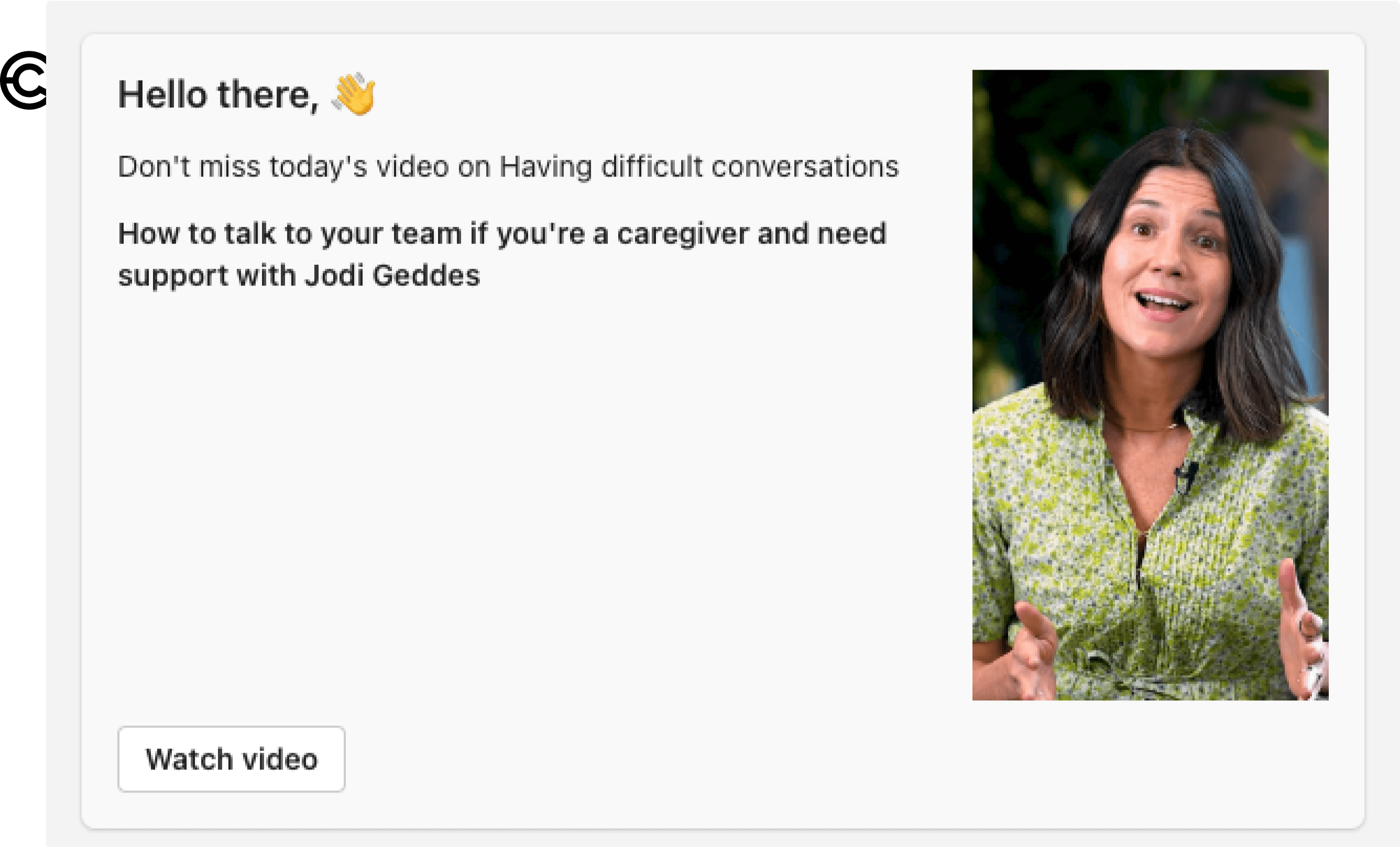
Today’s Circle In tip:
Balancing home life and work commitments
With Dominic Taranto (01:29)
Dominic Taranto shares his 8 best tips on how you can better balance your home life and work commitments.
Watch video
See more like this

Making users' first engagements a brand experience
Nail the
work/life
juggle
[Company] has invited you to join Circle In
Circle In will help you improve your work / life balance by:
Sending you learning nudges customized to your specific needs
Sharing its library of informative 90 second video clips
Hosting in-depth expert advice and checklists on how to tackle real world problems
Sign up
Original chatbot "error message"
12:07 pm
I couldn’t find anything that matches “parental leave”
While you’re here, take 90 seconds to flex your muslces in a new skill. Or if you need assistance, please visit our resource center.
Explore Circle In
Go to resource center
Updated chatbot "error message"
Sorry.
can’t chat
here
I’m only a simple bot, and can’t answer your question...
Instead of trying to chat here, why don’t you explore Circle In instead.You’re sure to find what you’re looking for in one of our short videos or longer articles.
If you need assistance on using our app, please visit our resource centre.
Explore Circle In
Go to our resource center
Visual design of the card is bland, looking the same as every other MS Office card
Visual design of the card is bland, looking the same as every other MS Office card
Generic text has no value and causes immediate user disengagement
The content order is incorrect, with the user's value proposition found at the end of the content
The content order is incorrect, with the user's value proposition found at the end of the content
Only one small CTA
Only one small CTA
Strong typography highlights the value proposition
Strong typography highlights the value proposition
Distinctive visual styling and branding makes CI posts stand out from other traffic and invites click through
Distinctive visual styling and branding makes CI posts stand out from other traffic and invites click through
Article summary shares intent of article before click through
Article summary shares intent of article before click through
Multiple calls to action invite more click through
Multiple calls to action invite more click through
Branding and title clearly share Circle In's value proposition to their users
Branding and title clearly share Circle In's value proposition to their users
This default "chatbot" response fails to explain why the user query failed. The CI chatbot doesn't have an actual chat function yet.
This default "chatbot" response fails to explain why the user query failed. The CI chatbot doesn't have an actual chat function yet.
Clearer communication explains that the CI bot isn't configured to respond to user chats. It then invites the user to visit the web app
Clearer communication explains that the CI bot isn't configured to respond to user chats. It then invites the user to visit the web app
Explanatory copy explains why a user is receiving this invitation, and why they should sign up
Explanatory copy explains why a user is receiving this invitation, and why they should sign up
Consistent branding means that even failed user interactions feel part of a user journey
Collaborative leave plans
Making parental leave a better experience
Collaborative leave plans
Making parental leave a better experience
Addressing the disruption and stress of parental leave
Circle In's Collaborative leave plans are designed to make a difficult experience much more achievable. The experience of parents-to-be as they prepare for parental leave, or return from it, is often less than ideal. This is largely due to the fact that both the parent and their manager are frequently unequipped to manage this transition successfully. For Circle In's corporate clients, parental leave is also a significant cost and risk. If parents-to-be have bad experiences their employer is likely to permanently lose human capital, or suffer reputational damage.
The manager’s vs the parent-to-be's experience
The perspective and priorities of the parent-to-be and their manager are typically highly divergent - especially if the manager hasn't experienced parent leave themselves. The collaborative leave tool is designed to share expert advice and resources that help both parties to work together successfully - delivered in handy formats that can be quickly and easily absorbed and acted on.
Interactive design
The interactive plan is designed to break down the parent-to-be's user journey into a sequence of 5 steps - each with relevant resources for both parents and their managers. In the longer term these resources will be interactive and transparent to both parties
Negotiating MVP
Because of the tight timelines I had to negotiate scope of the MVP, removing all interactive elements and replacing them with simple lists. Notes were left to aid CI in drawing up a roadmap that could be acted on in the future.
Collaborative leave plans
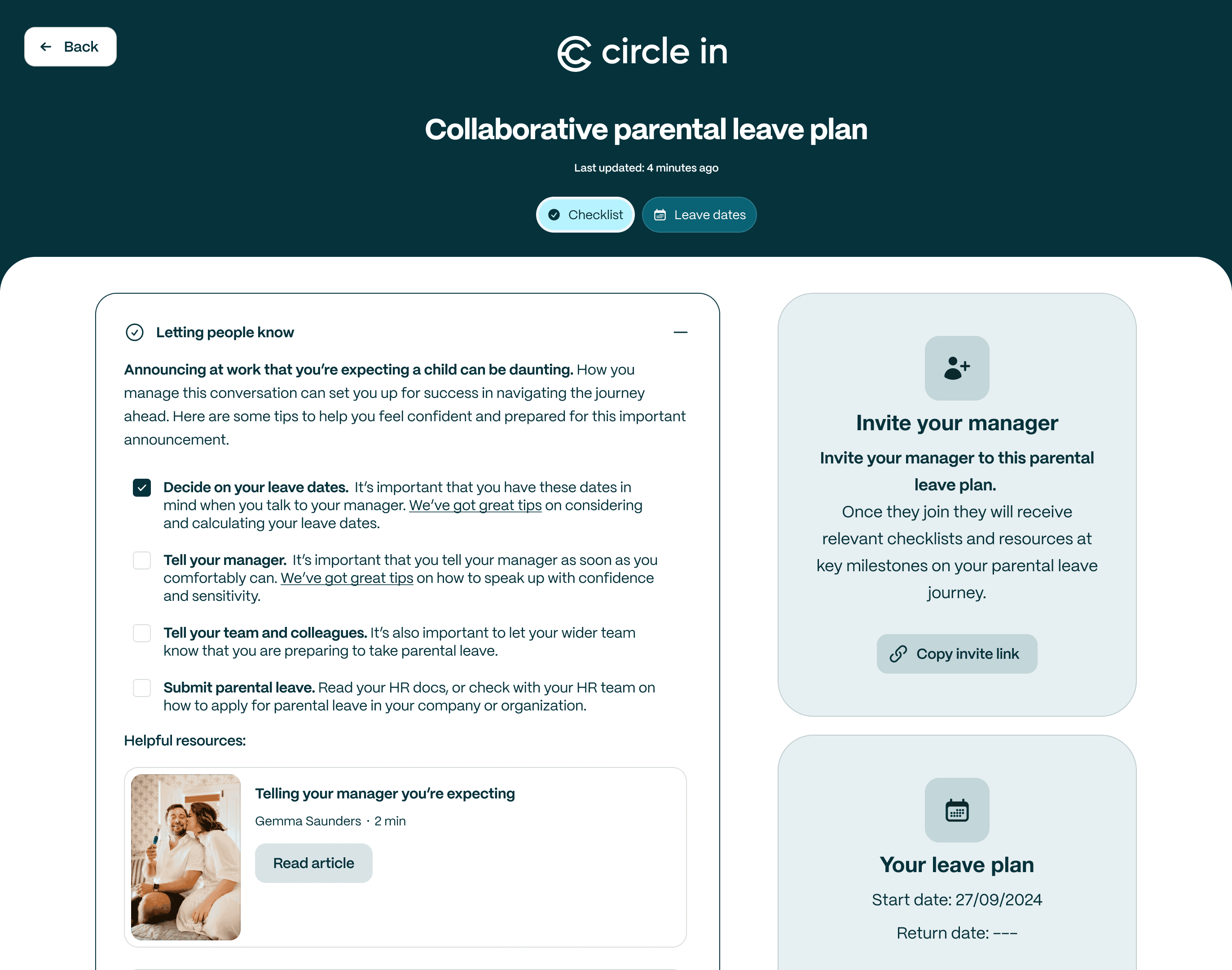
Both parents and managers are presented with a useful checklist of actions they can take to make the process smoother for all.
Helpful resources are presented for both parents and their managers.
A leave taker can invite their manager to participate in the plan.
Interactive prototype
Leave plan details can be added or updated at any point
Project outcomes
Project outcomes
Outcomes
Outcomes
Keeping customer commitments
Circle In had made long term commitments to start onboarding specific clients onto the new platform in September and October. The redesigned site went live a day early and new customers onboarded on time. Circle In's larger challenge was dealing with the backlog of other customers who wanted to migrate as well.
Increasing user engagement
User engagement spiked on the new platform, increasing by 230% in the first quarter after launch.
Improving customer onboarding
The new user onboarding funnel worked significantly better than the original. Not only was it collecting useful user data, it's conversion rate was significantly better than the previous funnel, the conversion rate jumping from 77% to 94%.


WANT TO get in touch?
Let’s chat
Thanks for checking out my work.
I believe in rapid iteration, early sharing, and learning from mistakes. I believe that design is about solving problems, not creating art. Good design aims to make small, meaningful improvements to people’s daily lives.
If you want to work with me, or learn more about my design process, don’t hesitate to get in touch.
Copyright © 2024 Stuart Steel
WANT TO get in touch?
Let’s chat
Copyright © 2024 Stuart Steel